Writing your ‘about me’ page might be one of the things that boggle your mind. But, you’re in luck. Today, you’ll discover the help you’re looking for.
After hours of research, we’ve discovered 24 of the amazing about me page examples in different niches. We’ll dissect them all one by one to see what you can learn. Along with that, you’ll also get your hands on a professional about me page template for free, insider tricks of the trade, and critical mistakes to avoid based on best about me examples for website.
In the end, you’ll be able to write your about me page like a pro in less than an hour which will turn your first-time visitors into raving fans for life.
Excited already? Well, great. Let’s keep going with top about me pages.
🔍 What is an About Me Page?
We're about to dive into one of the most personal and powerful pages of any website – the "About Me" page! Ever stumbled upon a website and thought, "Who's the genius behind this?" or "What's their story?" That's where the "About Me" page comes into play. It’s where:
- 🚀 You Share Your Journey: Not just the highlight reel, but the bloopers, the behind-the-scenes, the stuff that makes you, well, you.
- 😇 Trust Gets Built: It's like opening the doors to your digital home, inviting folks in, and saying, "Hey, this is me. This is my thing."
- 🎯 Your Unique Flair Shines: What sets you apart from the crowd? That unique sparkle you bring? Yeah, that goes right here.
- 👋 Conversations Start: An engaging "About Me" page can be the conversation starter, leading visitors to explore more, shoot you a message, or even share your story with others.
In essence, about me pages your digital handshake. A space where you introduce yourself, share your journey, passions, and give your readers a glimpse into the person (or team) behind the content. It's not just a bio; it's a storytelling platform that builds trust, establishes credibility, and helps your audience relate to you on a human level. Think of it as your online coffee chat, minus the caffeine! Let's dive right in and explore some outstanding about me examples.
💡 24 Great About Me Page Examples
1. Lauran Conrad
Lauran Conrad
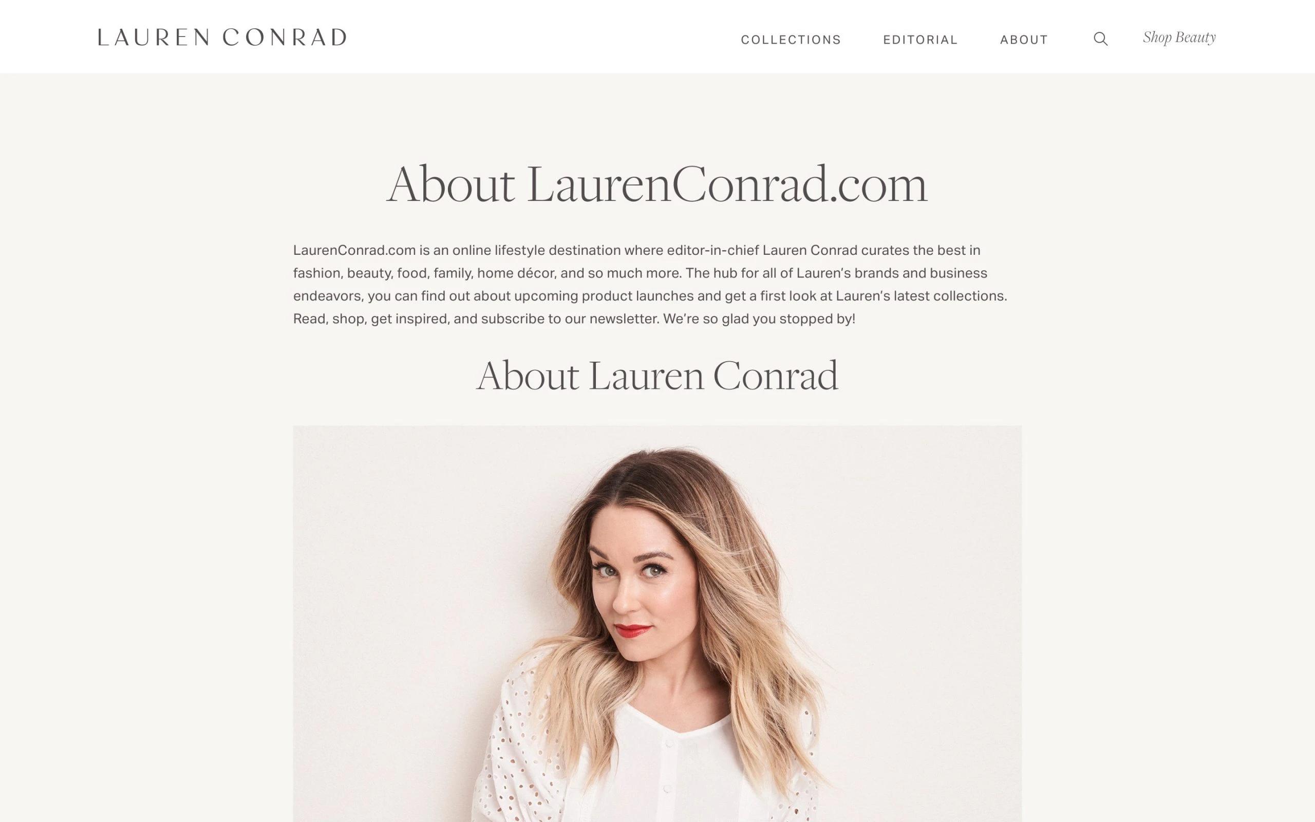
Lauran starts with the introduction of the blog; telling what she’s sharing, what readers can expect to learn, and what’s in it to benefit them. This about me sample perfectly illustrates how to connect with readers. Next, she includes her story. Lauran shares the story from her first publication all the way until now, including everything in between that she has achieved so far. And in the last, she adds her video — which is so good because videos are far more to connect better than simple text.
So, what’s the takeaway here from Lauran’s about page? Show how you can add value to the lives of the people who are willing to invest their time reading you, as it is shown in one of the about me examples for website here. Show your complete story to give context. And show yourself by including a video, if you can.
2. Danielle Dowling

Danielle Dowling
This about me page is an example of marketing yourself as a mentor or coach without being pushy and salesy. Danielle makes her about page all about her readers, which is why this page is amongst the best. She starts with a bold and beautiful headline, resonates with the pain points of her readers, and presents herself as a unique solution. But, she doesn’t stop right there. To build authority and trust, she shares wonderful things she’s been doing in the past 10 years and how she impacted the lives of thousands of people.
There’s something else to gaze our eyes upon, apart from her story and good writing. It’s the design. She uses flawless fonts with different colors, symbols, and pictures to keep us hooked throughout. The takeaway? Everything about it.
3. Mangools

Mangools
If you’re passionate about your blog, business, or agency, show it in your about page. Look at these guys, this is one of the about me examples that is short but so eye-catching.
The page starts with a headline, then as we scroll, there’s a small intro of what they do. This is one of the common strategies the best about me pages use. Then there are pictures of cheering team members, and each with a catchy tagline. Then they showcase their journey — all the struggles and great achievements — from the day of ‘big idea’ to this date.
The takeaway? Simply show you’re passionate about what you’re doing, you’re here to stay, and you’ll add value to the community. Include your story to connect deeply with your audience. And not to forget, a great design of your about page.
4. Dad or Alive
Dad or Alive
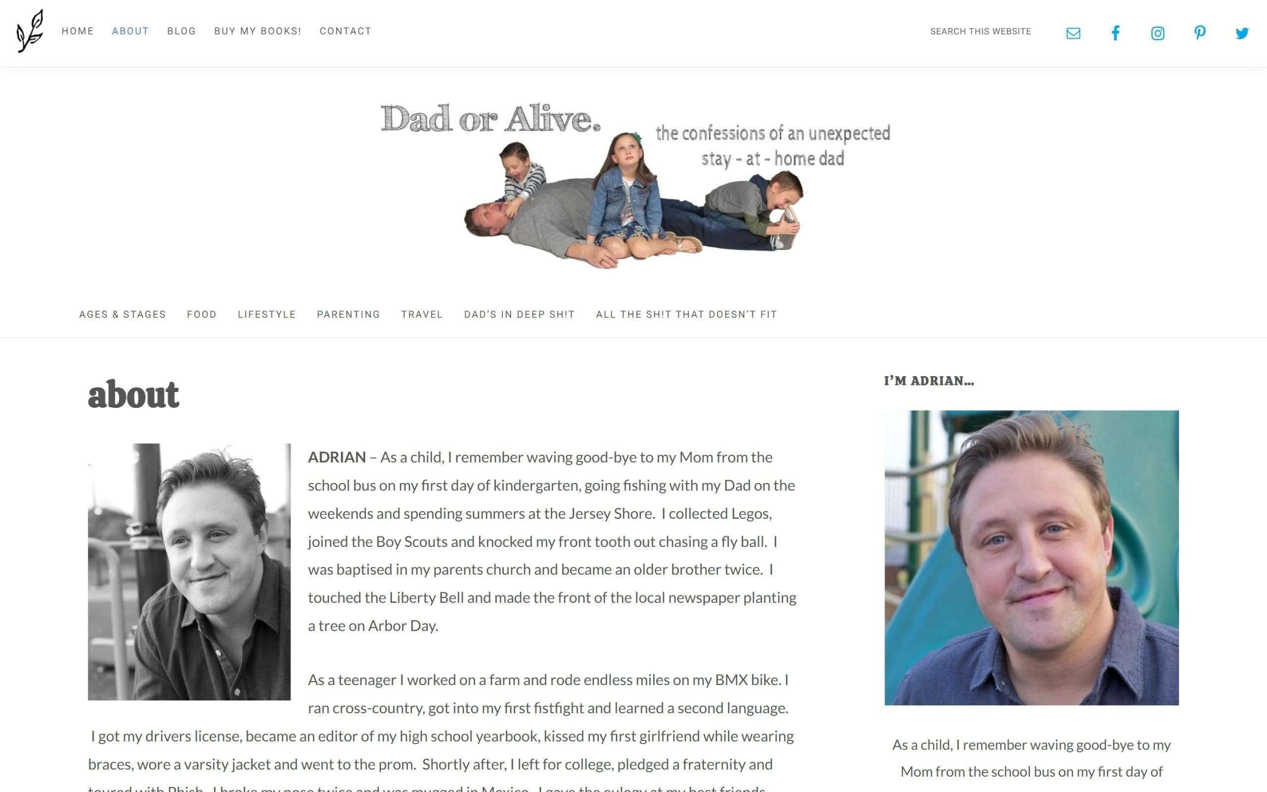
This is the epitome of connecting with your audience through storytelling. Andrian, ‘The-stay-at-home-dad’, shares parenting advice, inspirations, food, and travel stuff on his blog. On the about page, he tells his story from the beginning to the recent, in a very detailed manner. Then comes her wife, then her daughter, and then three sons. Everything is a story.
So, the takeaway? Share your story in an engaging way to be remembered and read. About me examples we handpicked for you show that their importance cant' be underestimated!
5. Hyperbole and a Half
Hyperbole and a Half
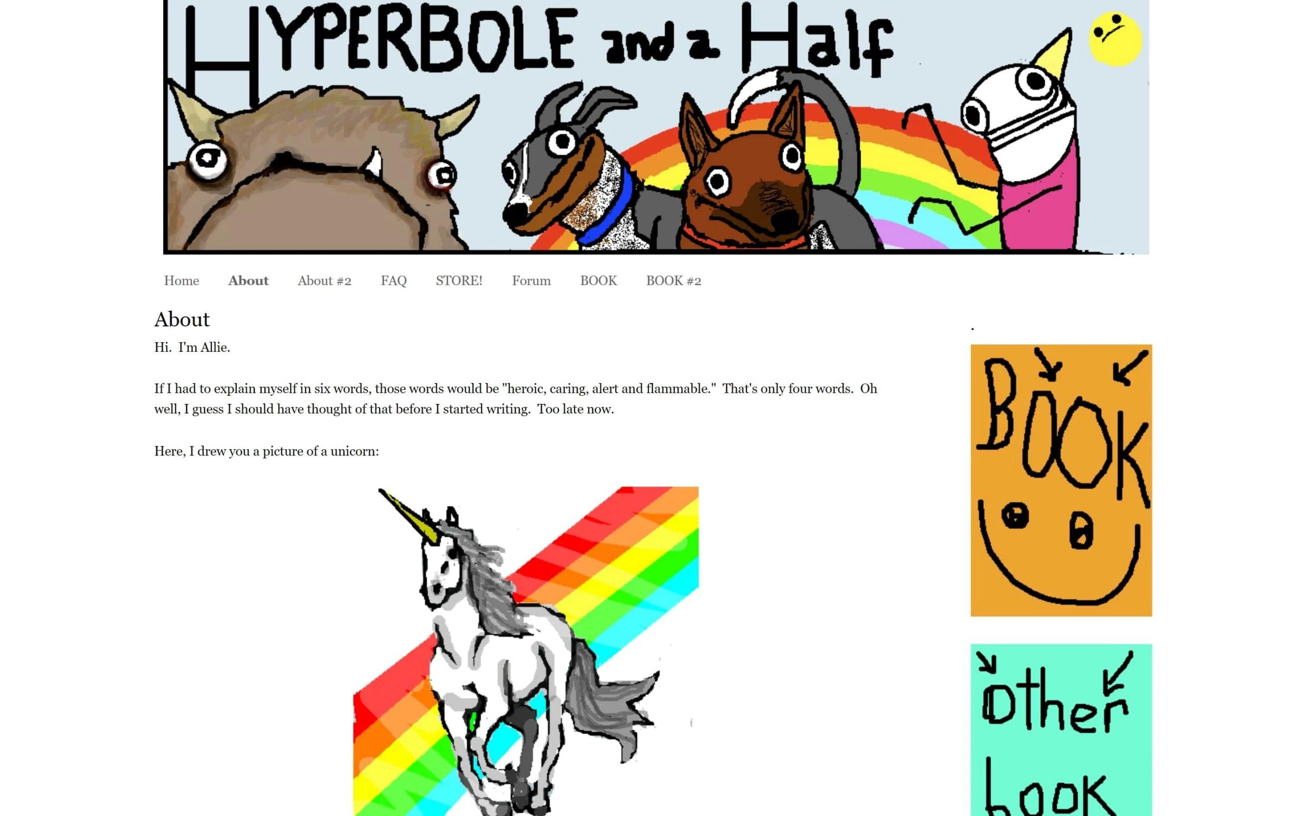
If you’ve your funniest quirk to show, the ‘About me’ page of your blog might be the stage you need. The best (or should we say the quirkiest?) example of that would be Hyperbole and a Half.
Allie, apparently, made two About pages. In the first one, she only shares a handful of information regarding her, with a drawing of a unicorn. Then she decides to create a second page to tell more about herself — and what do you know — this time she only shared two lines stating that ‘she didn’t even know what she was thinking while creating the second page’.
Now, on the surface, this page may not be ideal, but she got a LOT of engagement. So, guess it’s a trial and error method. If you’re entertaining, add fun to people’s lives and they’d love to listen to you.
6. The Book Smugglers
The Book Smugglers
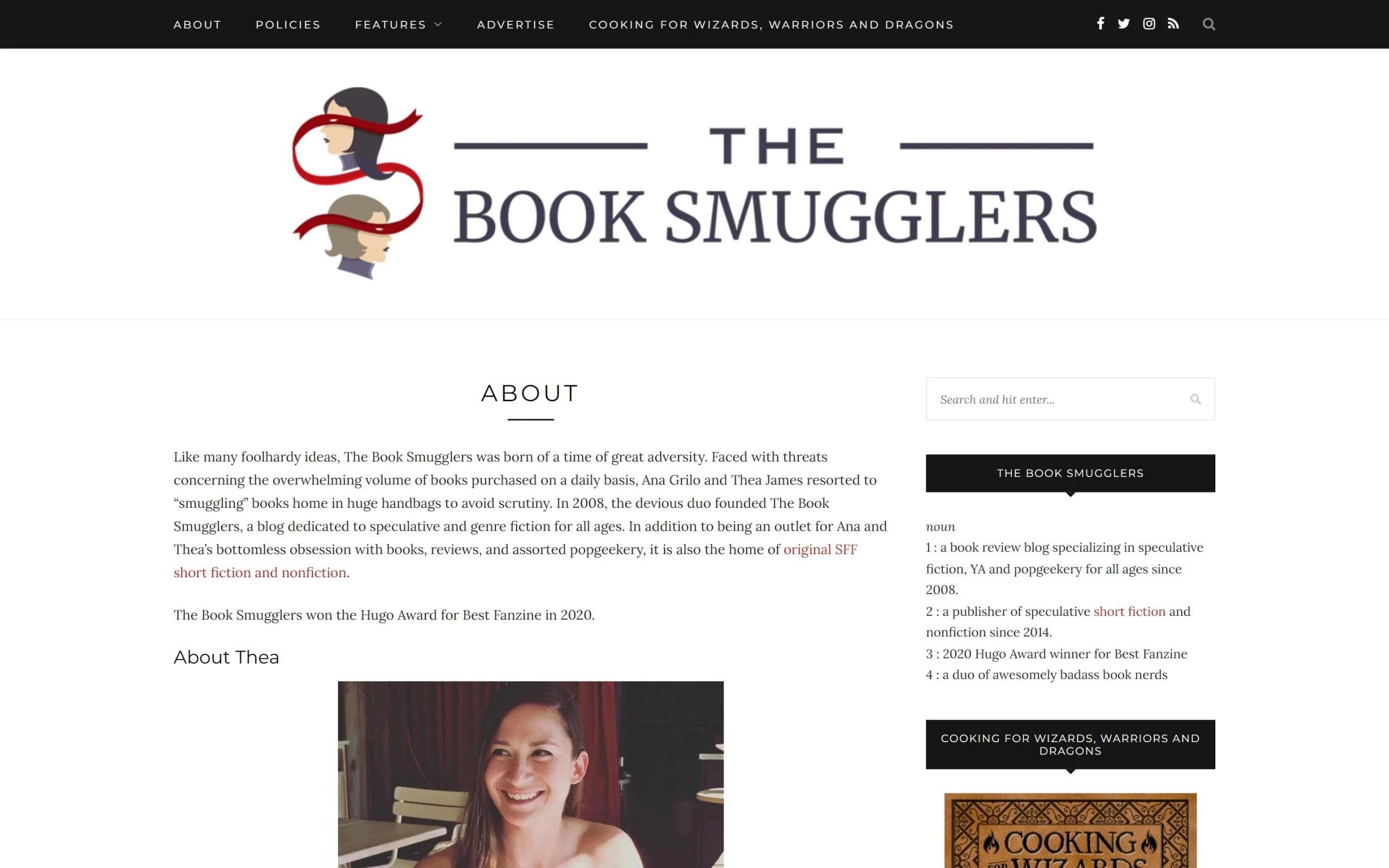
Well, that’s a fun way to say you love books: two partners, Thea and Anna, publish book reviews on sci-fi, horror, fiction, and many other genres. The about page shows their love for the books, introduction to the blog, and how it all started. As we scroll down, there are intros of the duo.
Takeaway? Be fun, human, and share your obsessions with the books, shows, sports, gadgets, or anything related to the theme of your blog. Plus, do include a story element as what motivated you to start. One more noticeable thing in this page is the CTA at the end that invites readers to other social channels. So, do the same to build an active community.
7. COOKIE + Kate
COOKIE + Kate
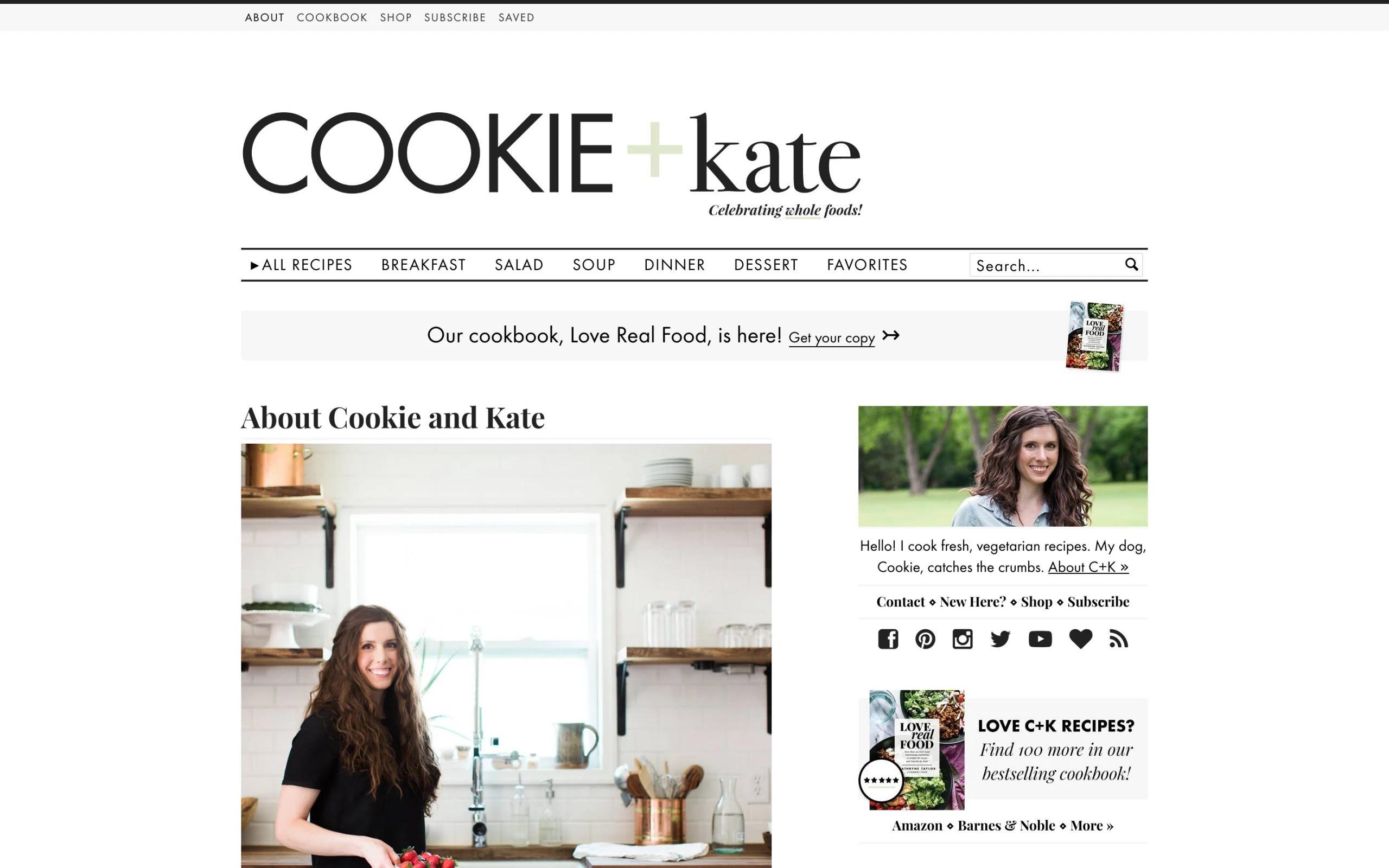
The simplest and cutest among about me examples so far. On the surface, it might seem like just another personal vegetarian food blog. But, it’s more than that. Kate includes the story of her cute pet dog, Cookie. She includes her own picture in the kitchen and the picture of her pet. That’s one of the reasons this blog connects deeper — because pets are cute and everyone loves them. There’s one more thing that’s noticeable: it’s the section of FAQs.
The takeaway from Cookie and Kate? Well, include pets in your blog if you’ve any. And, answer any question that your target audience might have regarding you or your blog.
8. Jen Carrington
Jen Carrington
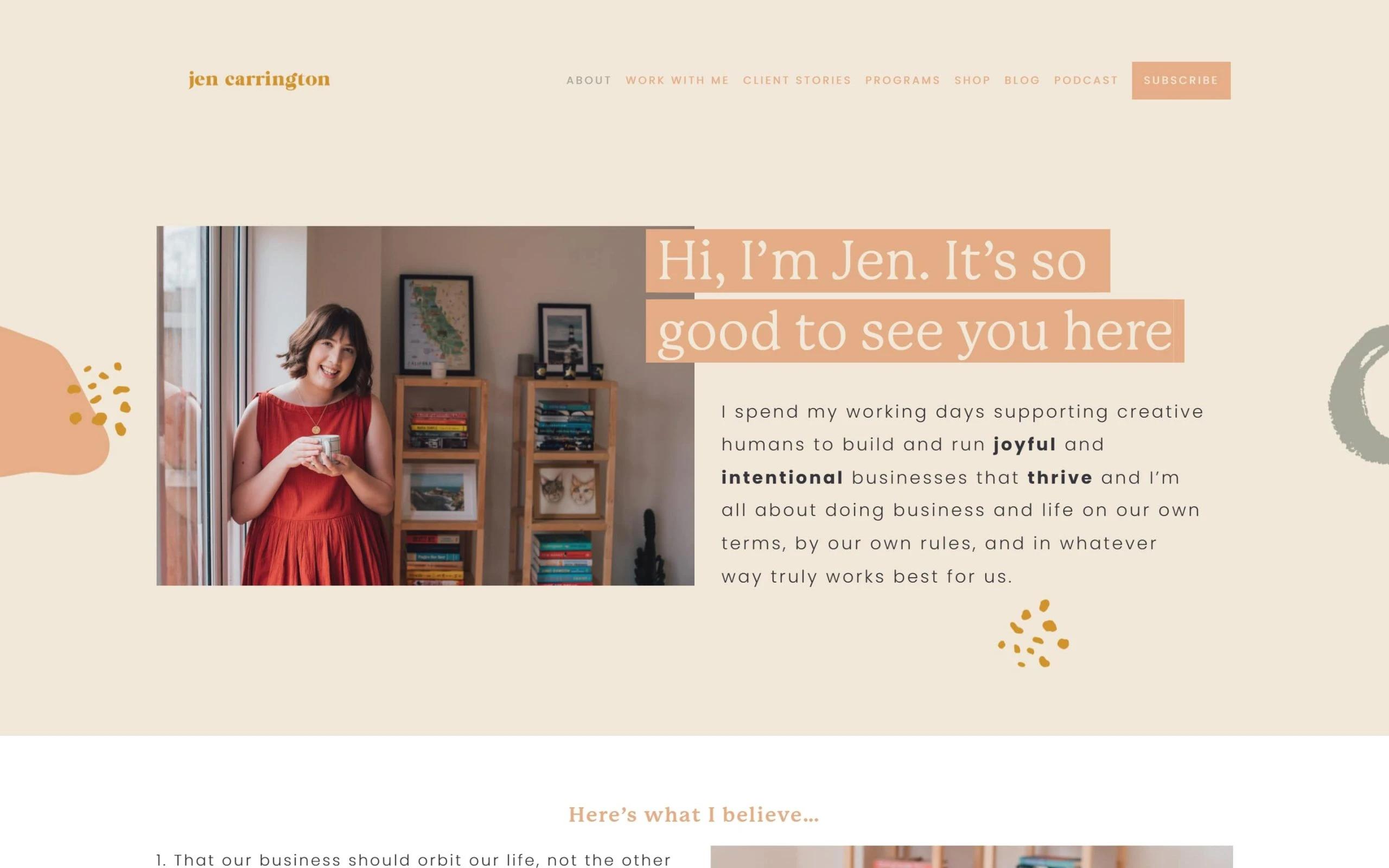
This about me is so good because it’s the perfect alchemy of writing, design, and storytelling. Jen, a creative life coach, shares everything about her; what she believes in, who she is, and her story of becoming a coach and a blogger.
This is one of the about me examples showa how personal branding can be both authentic and compelling. The takeaway? Tell your story and use a satisfying design that matches your blog’s theme. It's a blend that not only reflects who Jen is but also serves as a great example for others.
9. Joe Payton
Joe Payton
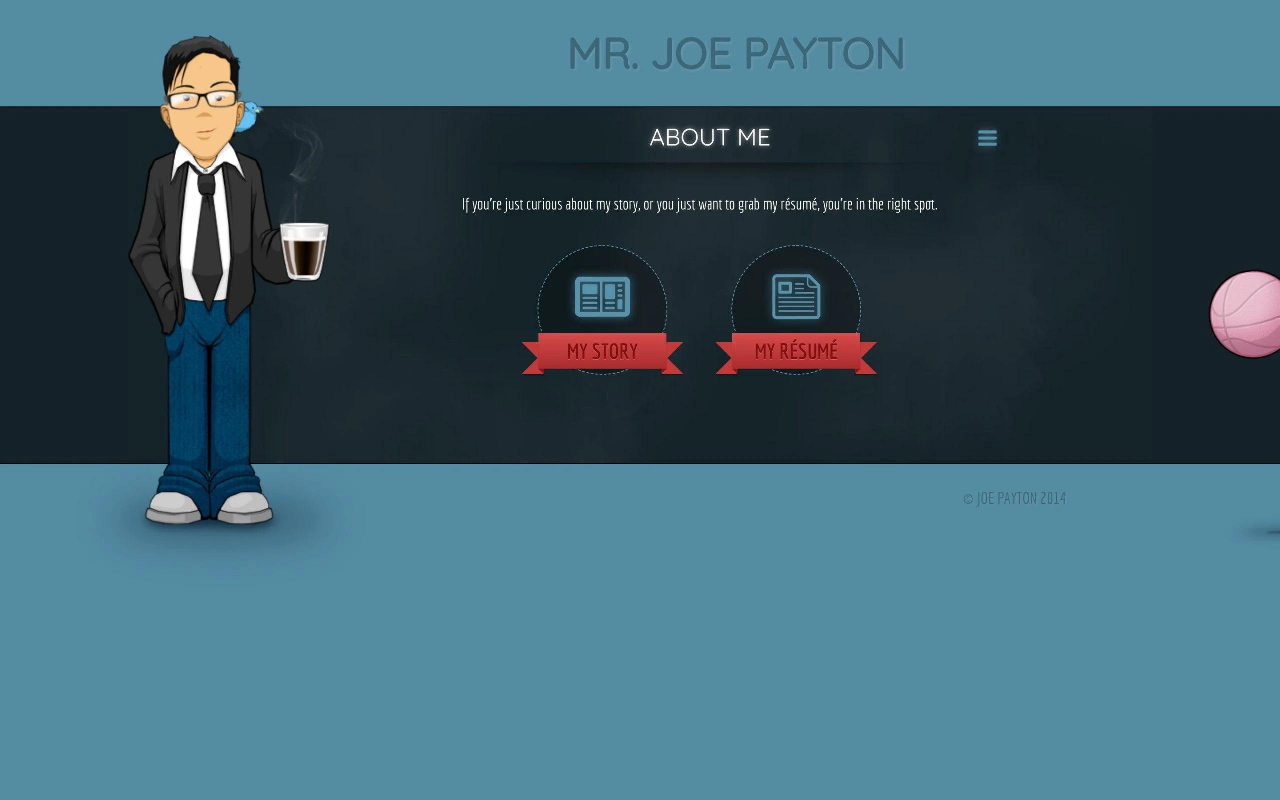
In just 169 words, Joe shares his whole story. He shares why he started and why he’s passionate about it; while being humble and confident, and interesting and inviting. With that, he also includes design characters to show his skills to attract potential clients.
This is yet another creative option among about me examples that shows how you can shortly tell your whole life story. It’s alright if you don’t want to drag a whole listicle of your story. You can be simple about it. And, remember to sell your skills.
10. Madison Butler
Madison Butler
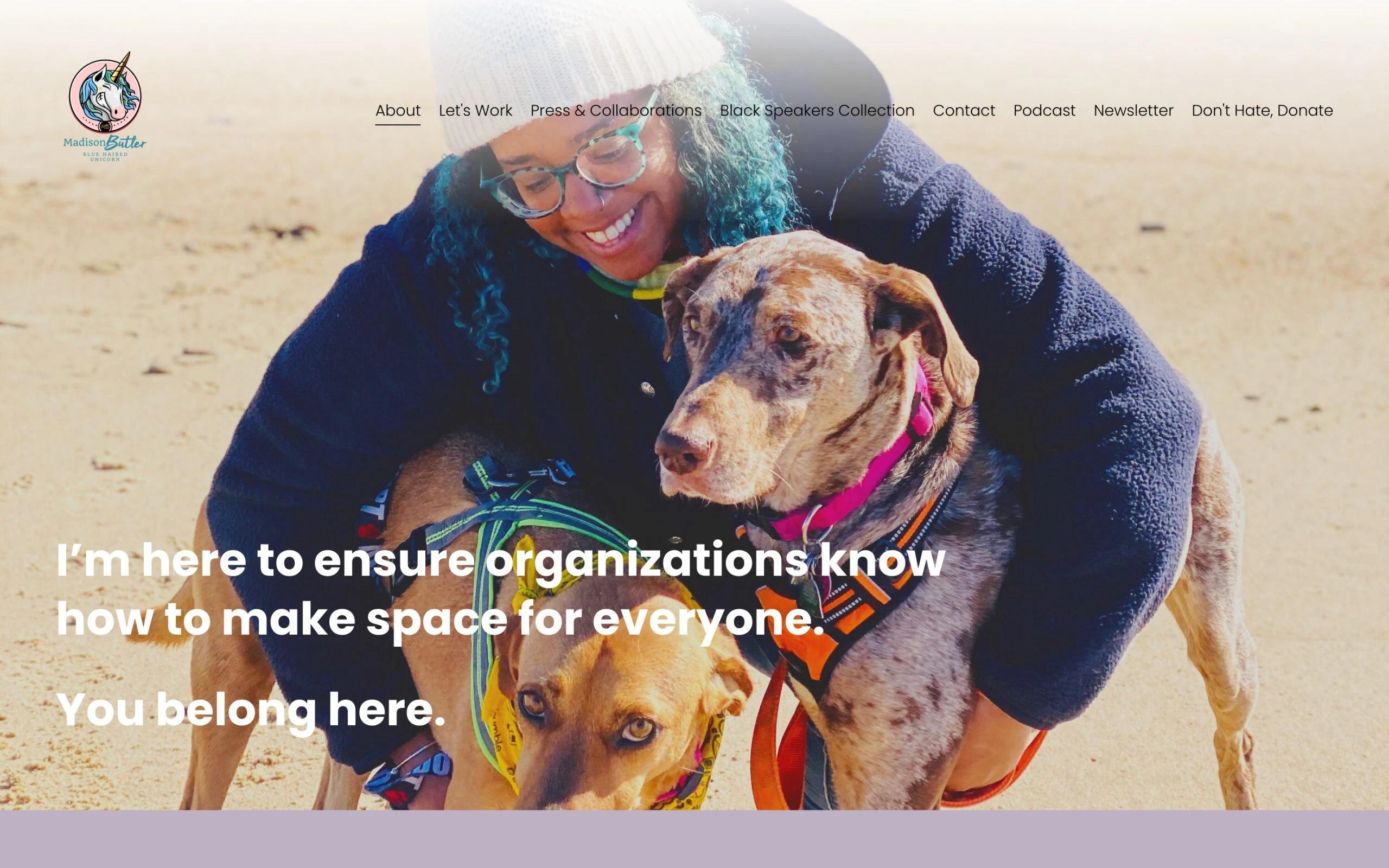
It’s bold, effective, and welcoming. Madison, HR and culture advisor, speaker, and consultant, shows all of it in just a simple headline: “I’m here to ensure organizations know how to make space for everyone. You belong here.” The one in the end that says, you belong here, is so powerful and invites visitors to become a part of her community. Then we see her story as we scroll.
This is one of the best about me examples that speaks values loud and clear. See how they cut it short but stay encouraging? Truly a smart about me sample for you to get inspired.
11. Sara Dietschy

Sara Dietschy
Although she’s only an individual YouTuber, she has not confided her ‘about page’ to herself. Sara shares only a paragraph about her and the rest of the page goes to other content creators, communities, and companies she’s partnered with.
Giving something more to imagine and diversifying her page, she makes a positive and humble impact. And, of course, hard to ignore, the iconic design template of this about me sample; a video as a header, complimenting colors, small blocks of content, and HD pictures.
Be diverse with your intro. Make it about the community, other creators, and simply add more depth to your about page. But wrap everything in a unique design template.
12. Marc Ensign
Marc Ensign
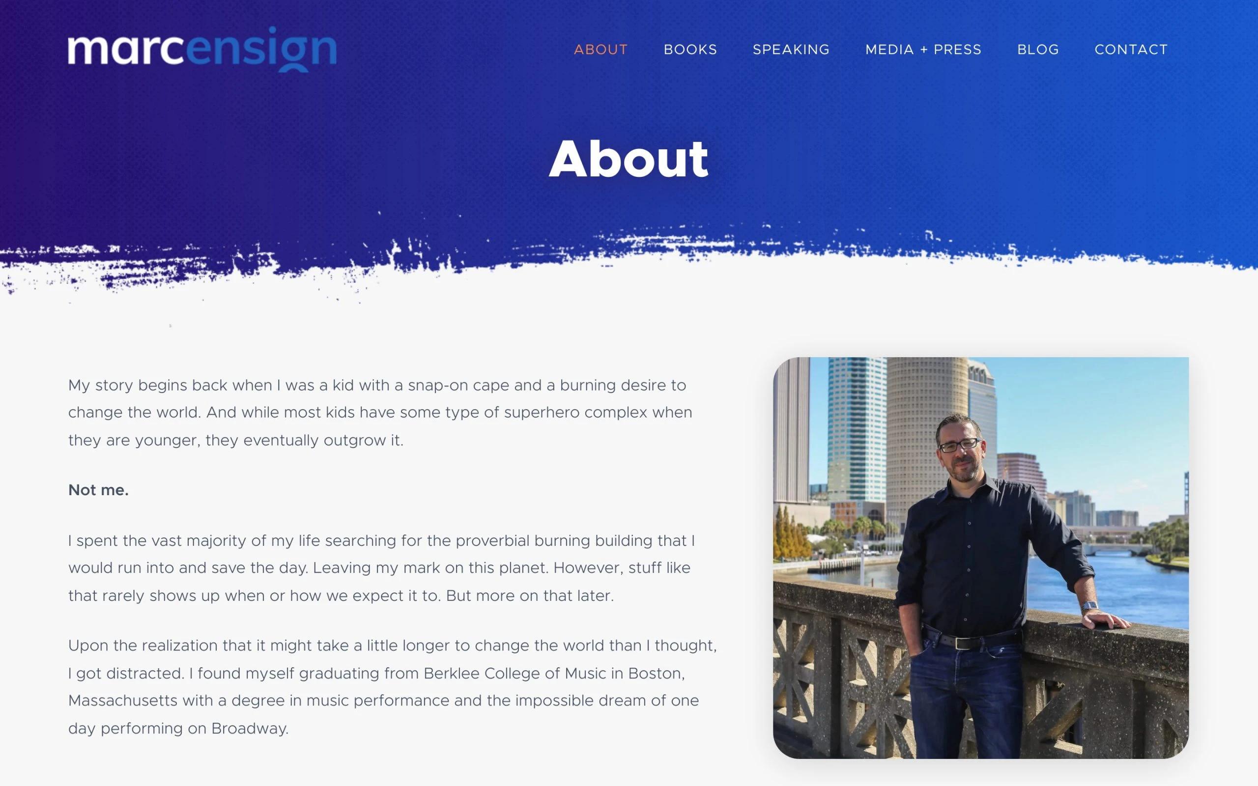
This page is a masterpiece in regards to storytelling. Marc shares his complete story in a fun and simple way that even a seven-year-old can understand easily. He’s so humble with his words as we see in the end when Marc invites us to other social channels: “…if you have room for one more friend, here’s where you can find me…”
The key takeaway? If your profession is difficult to comprehend for a layman, you can become simple with your words to connect with everyone. When looking at about me examples for website, this is a strategy that often stands out. The only thing you want to make sure is that you deliver your message simply and clearly.
13. Tech Savvy Mama
Tech Savvy Mama
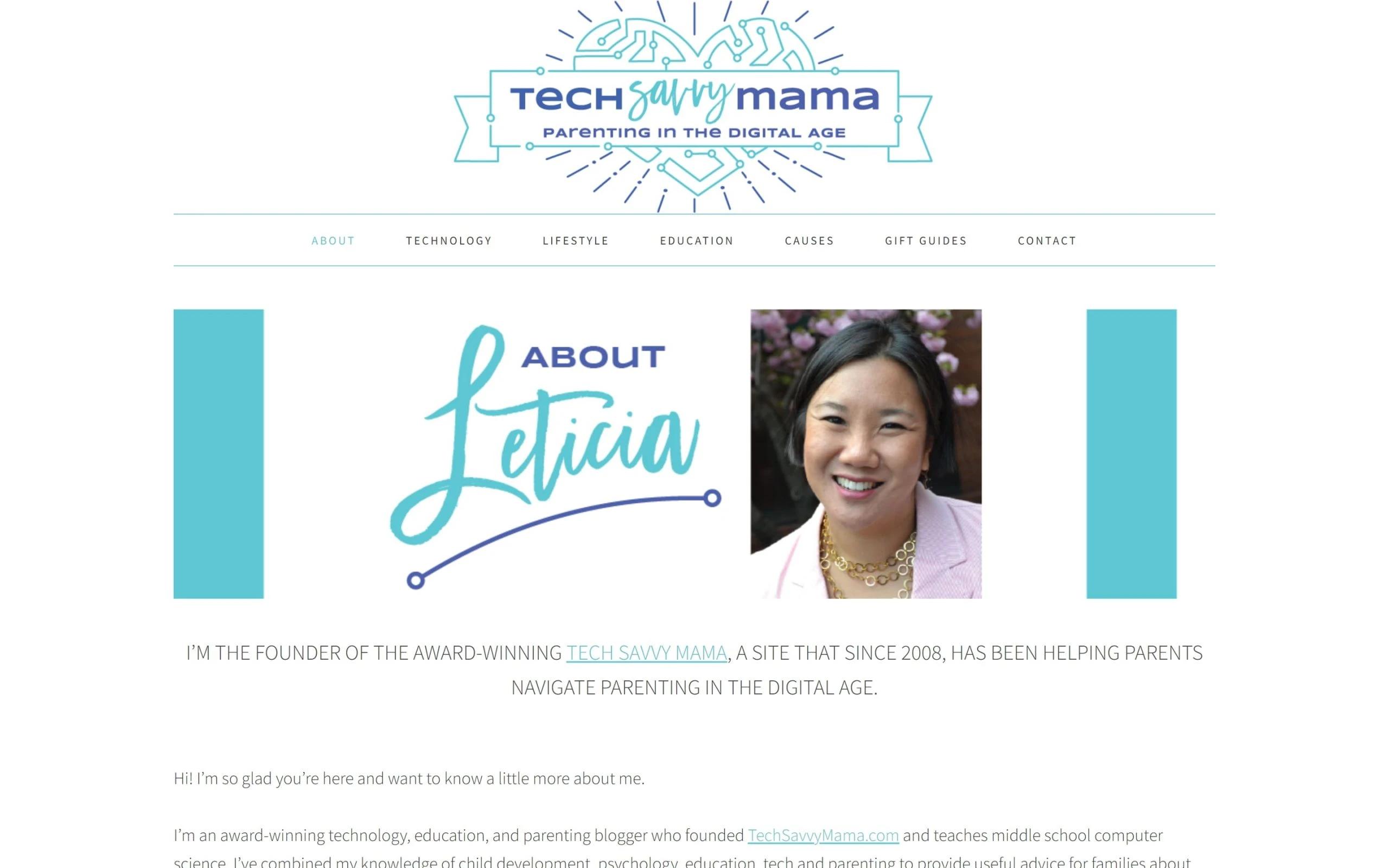
As we scroll, taking a cue from about me website examples, we discover Leticia’s about page filled with reasons as to why parents should take her advice. She starts with a bold headline that builds credibility and tells what she’s doing on her blog. Later as we scroll, we find her full story: all the great things she did, where she lives, her family, and everything in between. In the end, a bold CTA invites us to her other website.
The takeaway? Build trust and authority. Whether your blog is about parenting, cooking, pets, fishing, DIY, or anything around — give reasons why someone should listen to you. This is definitely one of the best about me examples for website to consider while coming up with your ideas.
14. Amber Fillerup Clark
Amber Fillerup Clark
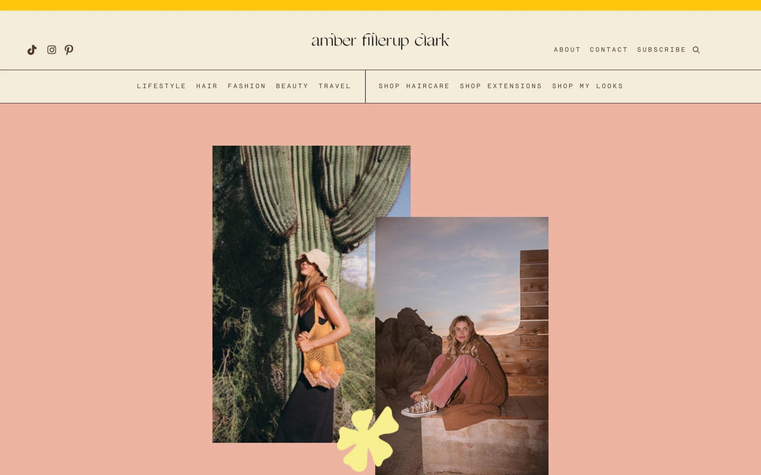
This about me page template that Amber uses is simple and beautiful. Previously named as BareFootBlond, Amber has now shifted to this name. The unique thing about Amber’s about page is that she makes it all about her community.
Even though this is one of the website about me examples that includes information about herself, family, and the things she does, still, she puts everything in a way that shows she values her community more than anything else.
The lesson here is clear; even though your About page is about you, include the audience in it so that they feel welcomed to be a part of your blog.
15. Jared Christensen
Jared Christensen
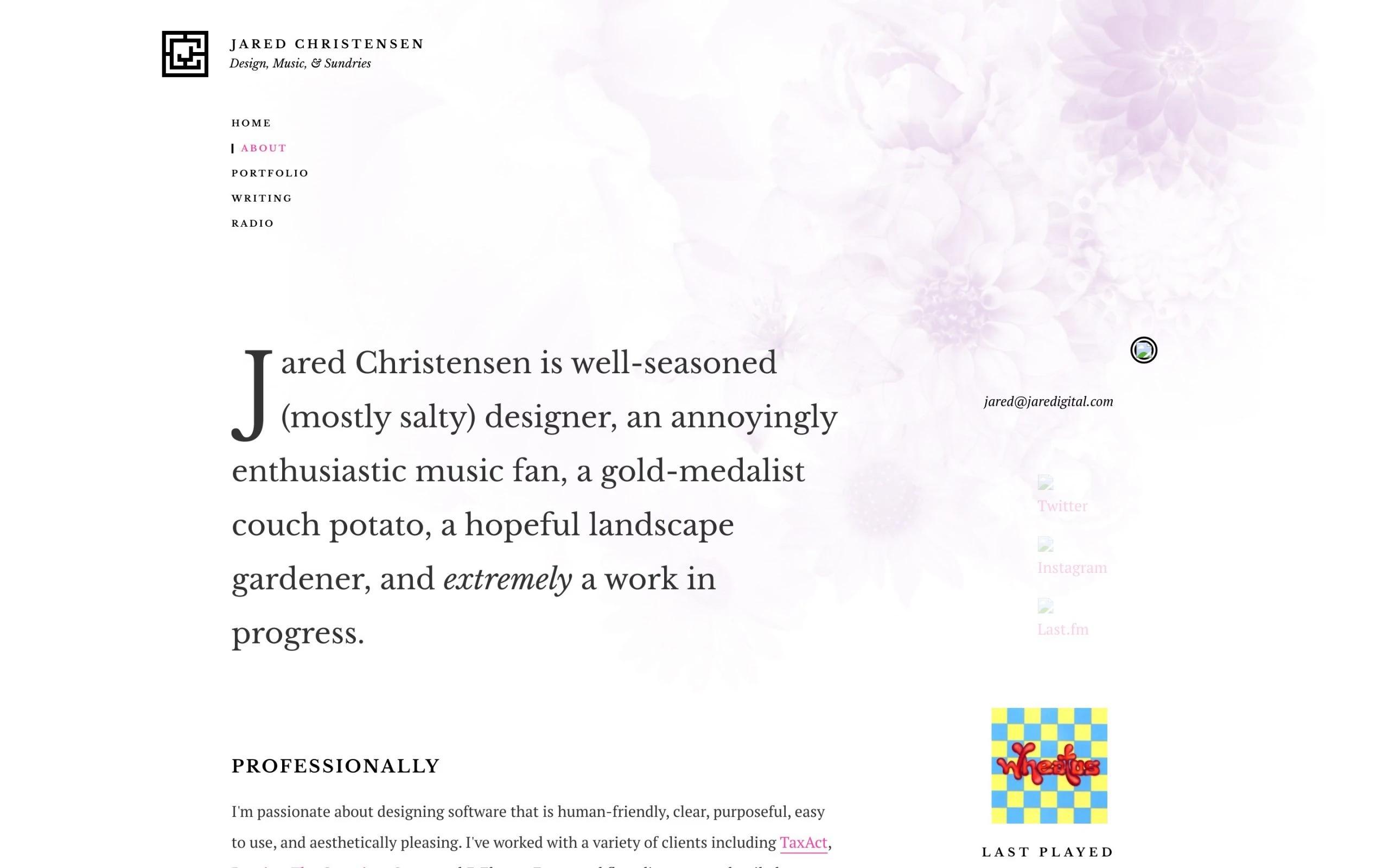
Jared uses a third-person approach to describe his profession and passion. The whole page is simple, short, and to the point. A little amusing element is used to keep us reading, “as anyone cares.” So, you can use their idea as an about me page template to find something that suits your website.
Just like in other good about me pages, it helps in expressing the personality of the brand. The takeaway here is to keep it simple, and if you prefer or if it fits with the theme of your blog, you can use a third-person approach. It feels more credible and professional.
16. RecipeTinEats
RecipeTinEats
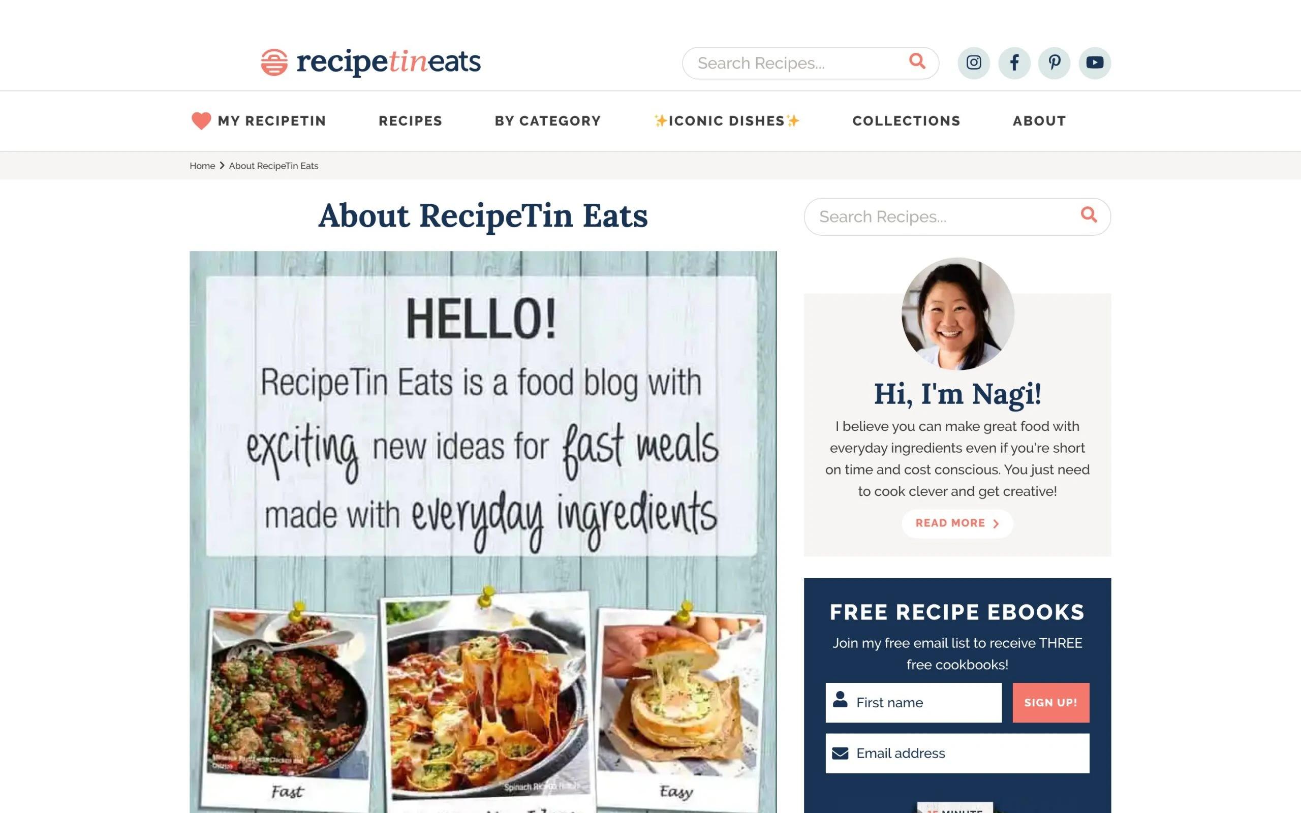
Notice, even though the food blogging niche is supersaturated, Nagi still makes herself stand out by speaking her unique values: “Recipe Tin Eats is a food blog with exciting new ideas for fast meals with everyday ingredients.”
Through the headline only, readers can expect what they can get from her blog, and how her blog is unique. Also, the design she chose, compliments the theme.
The rest of the page is her story, her picture with the pet, and her unique cooking philosophy. Then we see promises about what readers can achieve if they devote time to her blog — again, that’s important. And last, of course, an encouraging CTA that invites readers to email her, which basically means subscribing to her newsletter.
The key takeaway? This is one of the website about me examples that show how important it is to peak your unique values loud and clear, and tell how you can benefit readers.
17. Raelyn Tan
Raelyn Tan
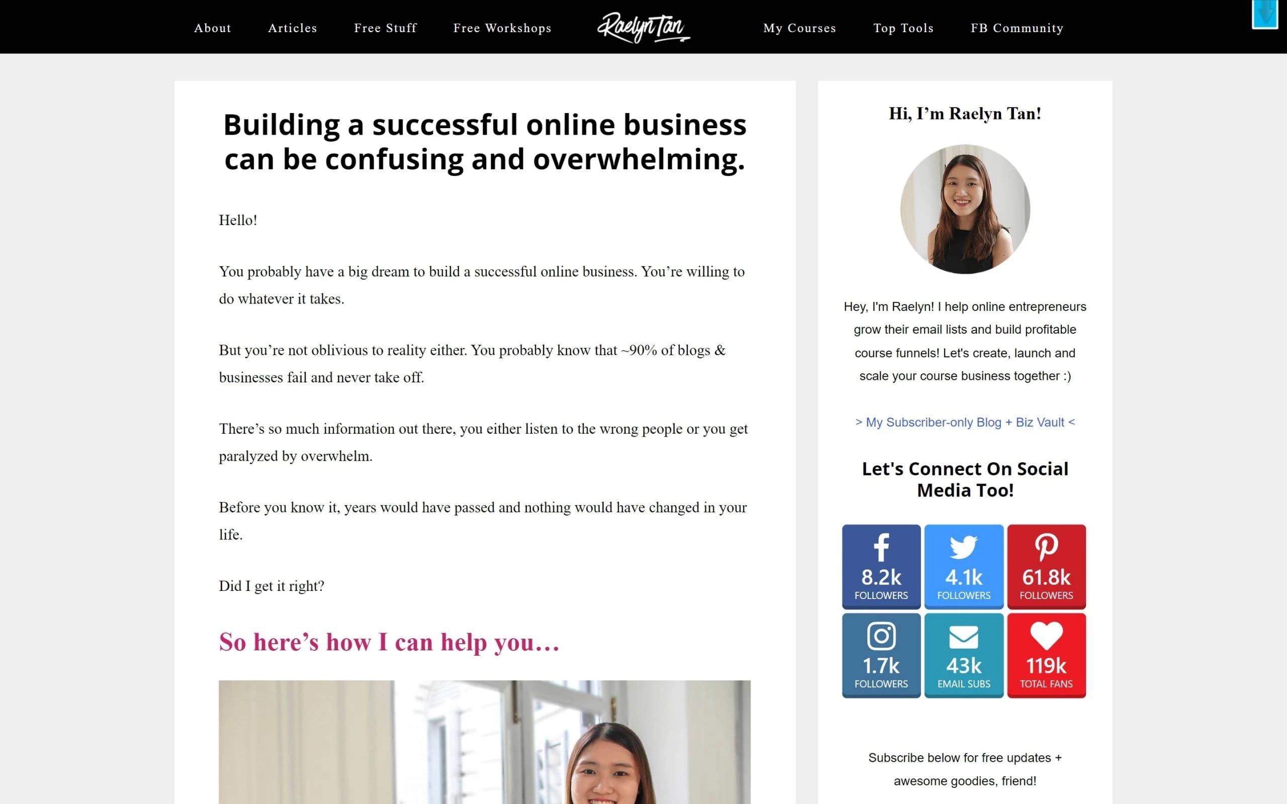
The headline calls out the biggest pain point of her audience. Raelyn then resonates with them, builds empathy, and provides her blog as a unique solution. She lists all the great things they’ll achieve and invites them to subscribe to her email newsletter (one CTA here in the middle).
Then she shares her story, builds credibility, and again shows how she can help. In the end, she includes a second CTA that invites readers to join her list, but with a different setting: she offers a free list of tools that help her blog daily.
The takeaway? Build empathy to let them know you understand them. Add multiple CTAs if possible. Offer a free value-packed gift in return for their emails.
18. Adham Dannaway
Adham Dannaway
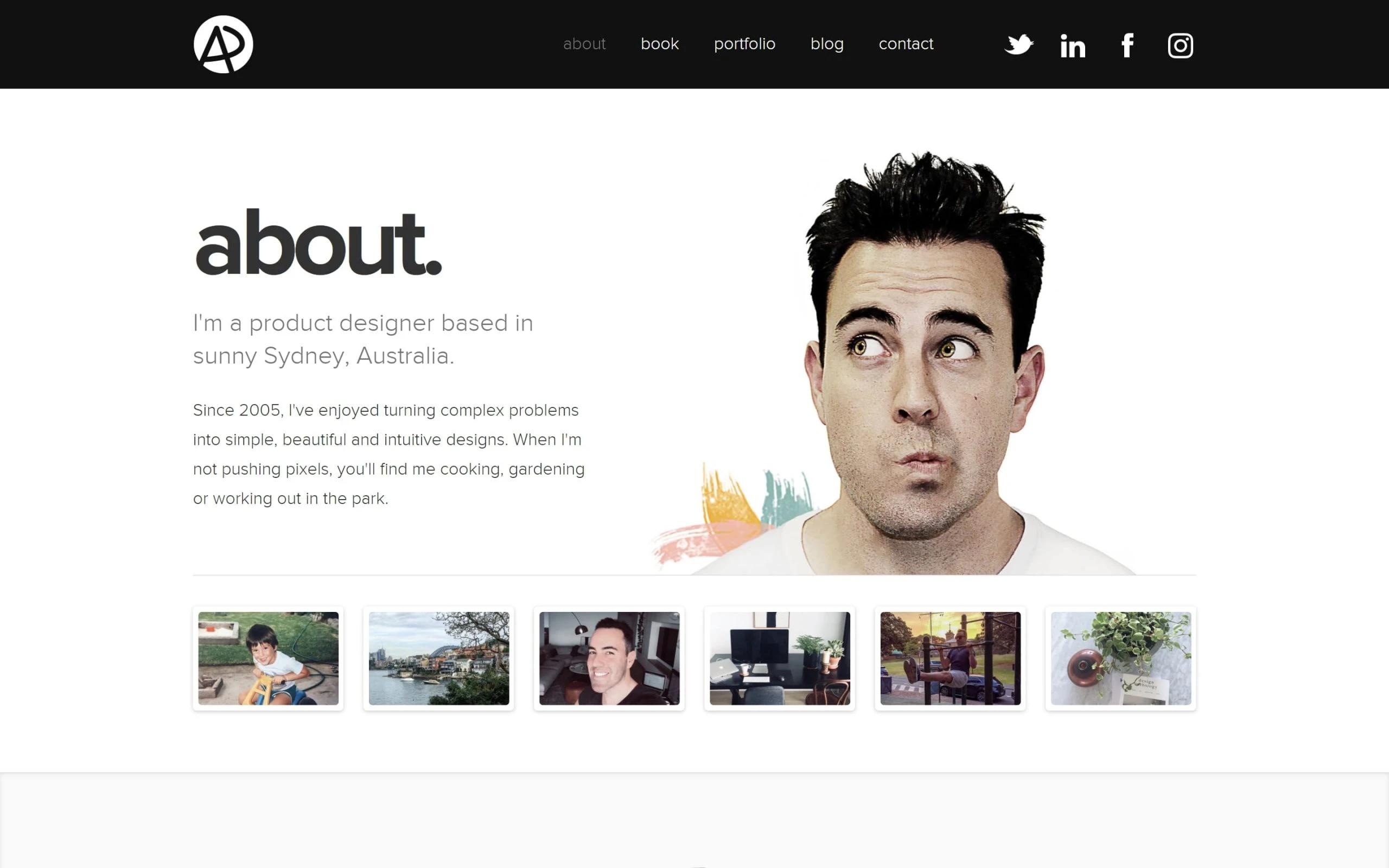
Adham uses a simple minimalistic kind of design layout, like other successful about me pages do. The key thing, he adds his short intro, photos of his workspace, lake of his city, him working out in the garden — this just adds more depth to his simple about me page.
The rest of the page also has a complete story and achievements. He adds random fun facts and fun skills to shape the quick-witted personality of his website, a quality often seen in great about me examples for website.
Adham only misses out on a unique CTA at the end. The rest is thumbs up. So you can learn your lesson because this is one of the about me examples that show what to do with your text.
19. Tracie Fobes
Tracie Fobes
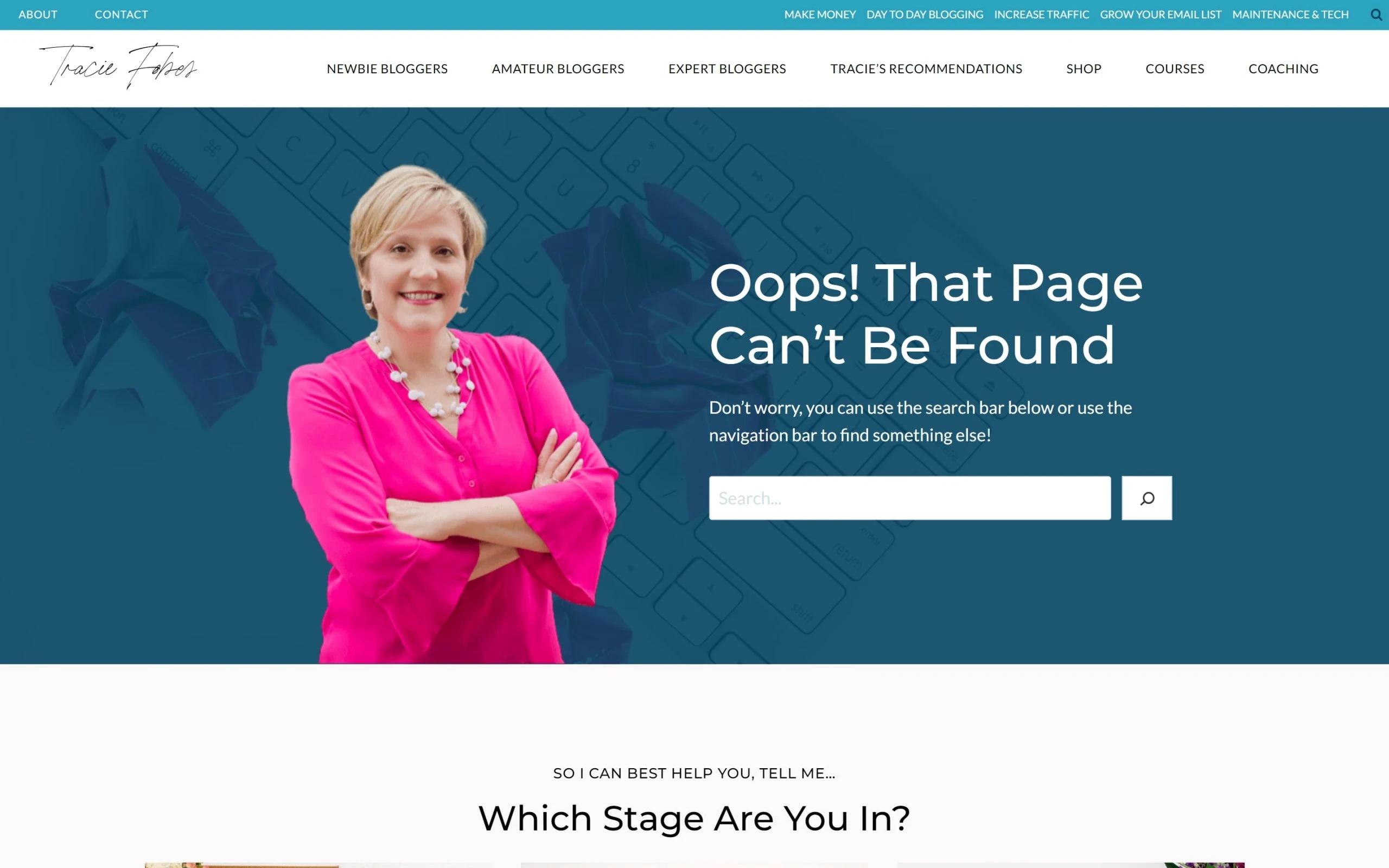
Welcoming photo in the header, a quick intro of what she’ll be helping with, and below a sub-headline as a lead that resonates with the struggles of her audience — these are points are spot-on. Then she repeats the same questions her audience has, which she obviously discovered after deep research.
After that, she tells her own quick story about how she was once in their shoes, and how she became a successful blogger. In the last, she adds CTA as a solution to the problems of her readers that they should subscribe to her newsletter in order to grow their blog.
This about page is a perfect example of how you can always make it about them and very little about you. Give the vibes that you’re here to support and help your readers, and they’ll, without a doubt, stay connected with you.
20. Marie Forleo
Marie Forleo
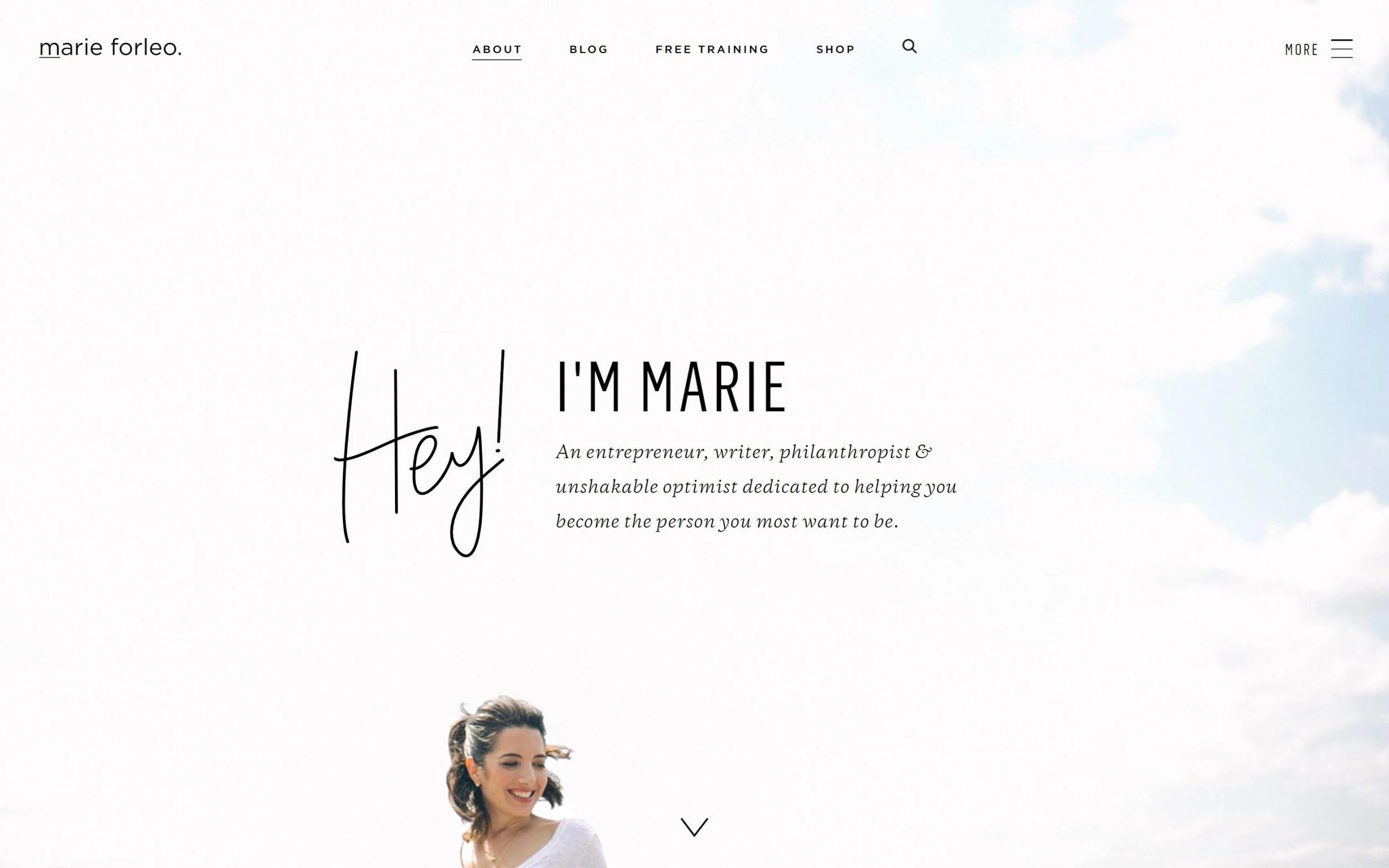
Enter, and see a beautiful headshot of her smiling, hair in the air, an expansive view of blue sky in the background, and the short text that says who she is and how she can help you.
Wholesome vibes, but her message seems vague: “…helping you become the person you most want to be”. It doesn’t exactly tell how she’ll help and what exactly readers will become until we scroll all the way down.
Everything in between is her story, unique values, and validations. In the end, there’s a CTA that asks to haul on to other useful stuff, which is great if she wants us to stick around there.
So, based on these about me examples, we can make it specific to what’s in it for them right at the start.
21. Backlinko

Backlinko
Backlinko, run by Andrian, is one of the most credible resources to learn SEO. he beauty of this ‘about’ page, similar to other website about me examples, is the simplicity, and how every section values the reader.
The about page tells exactly what’s in it for readers right within the first sentence. Then there’s credibility building, two CTAs, and only a few lines about the creator at the end of the page.
The most noticeable thing is how Andrian uniquely positions Backlinko that makes it stand out amongst other SEO experts: “Most experts say SEO is about great content only, but it’s not. There’s more exclusivity Andrian learned the hard way, which he’ll share without any fluff”.
Sharing exclusive tips and strategies suggests readers won’t find these insider tips anywhere else, so they should better subscribe to his newsletter.
The takeaway: Make it all about readers. Position yourself uniquely, which will help you stand out from your peers.
22. XO Sarah
XO Sarah
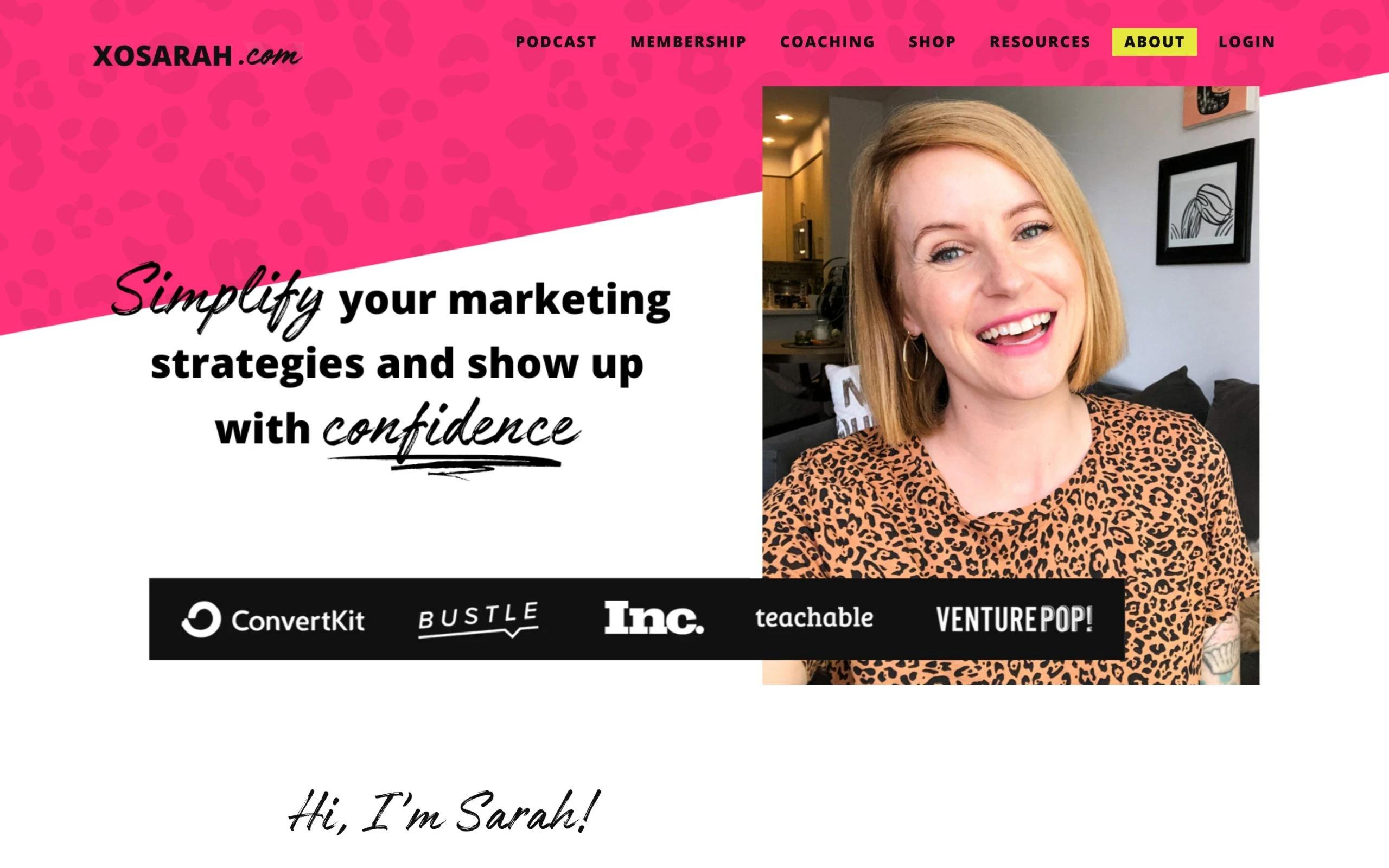
Were you looking for the most shining website about me examples? A cheering selfie with the hand saying ‘hi’, Sarah calls out the biggest pain point of her audience in the headline, which is a good sign to show that she understands the struggle of her readers. Then she builds authority by attaching the logos of the brand that trust her services.
And her story goes on saying how she got there, she includes some stats, and finally, she promises how she can help. Another noticeable thing, she offers a free book that might help her readers, as a CTA.
Now that we went through lots of about me examples, you know how offer a free gift, promise benefits, and call out their pain points from the beginning to let a reader feel you understand them.
23. Social Triggers
Social Triggers
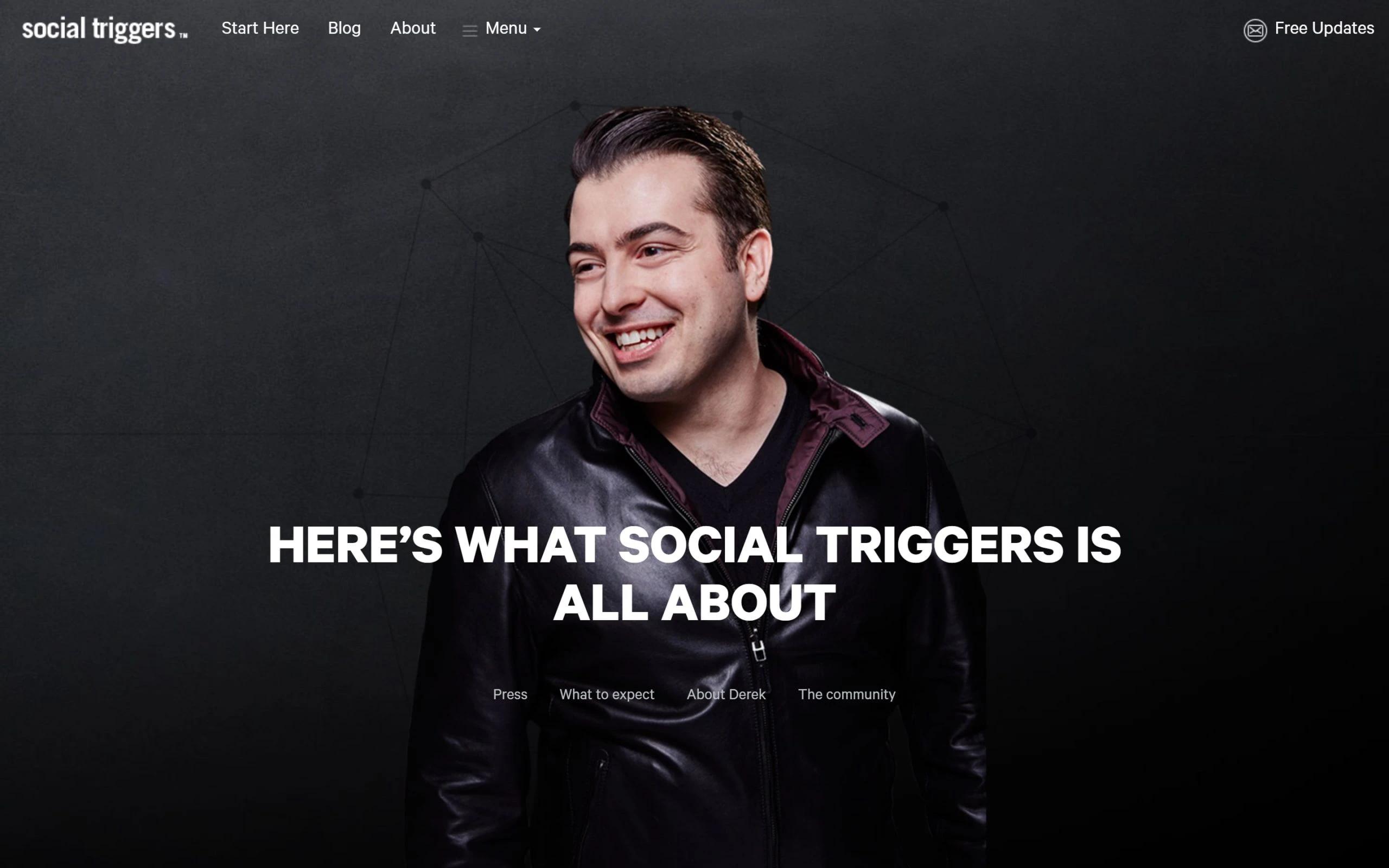
This about me page is SO professionally done. Right at the start are trust and authority building by displaying the logos of the brand Derek worked with. Next, he calls out his audience by repeating the same questions/struggles/pain points they might have. Then he offers his free Blog & YouTube as a unique solution to their problems. After that, there’s a little bio about who he is and how he got there.
In the last, he shows social proof; a community of thousands of people who have joined his newsletter already. And using the same proof, he asks to hop on for free value.
The key takeaway? Validate yourself and your skills through any proof, just like about page examples do. People will join you.
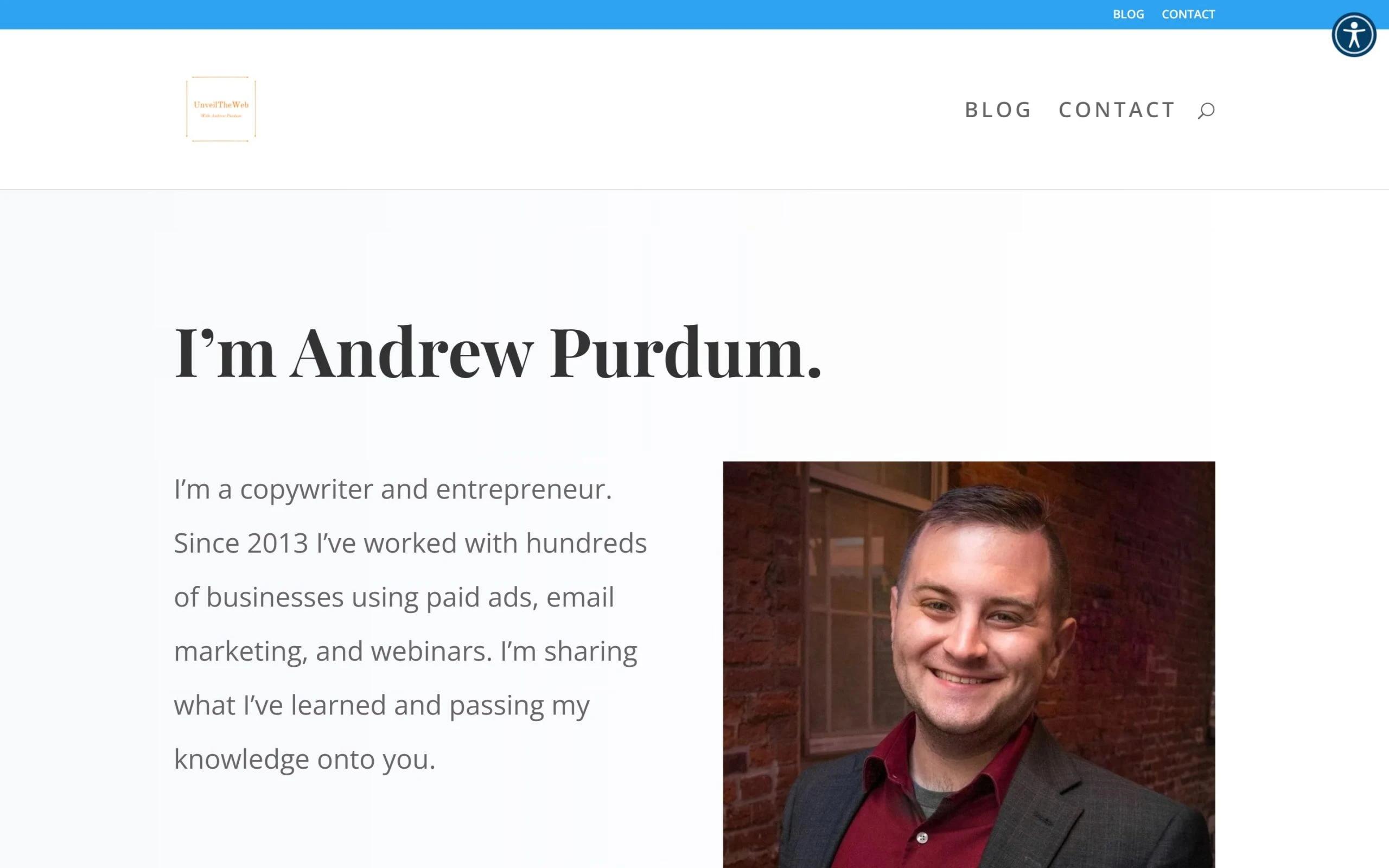
24. Unveil the Web
Unveil the Web
Andrew’s about me page, much like many about me pages out there, is very simple and straightforward. Within the few lines of the intro, he talks about who he is and what’s in it for the readers. This is probably one of the rare about page examples that are perfect to follow.
There are no long stories or anything like that. In the middle, there are some featured articles, and at the end, there are two CTAs; one that invites business owners for his services, and the other, for subscribing to his newsletter.
Two CTAs at the same time, at the same place, might create confusion. But, if it’s working for him, great.
The takeaway here is that it is better to simplify what’s in it for the readers. And add multiple CTAs where they fit, for example, one at the start, the other in the middle, and another at the end. But including two or three at the same place is usually disliked, as it leaves the audience confused.
👀 4 Reasons Why You Should Have an About me Page
1. It Speaks Your Values
Your ‘About me’ page is the place to show what you believe in, what you want to achieve through blogging, and how you can help people. You need to especially communicate this to shape the personality of your blog. People will relate to your message, style, and vision, and will stay connected with you.
2. It Connects with People at Personal Level
Connecting with your audience at an emotional level is so important. Not only will you grow as a blogger with more reads, but you’ll grow as an esteemed respectable blogger.
But, through your about page, show that you genuinely value your community. How? Look at Amber Fillerup Clark in today’s about me page examples.
3. It Builds Trust & Authority
By showcasing your expertise, awards, or honorable mentions on your about page, prove that you’re a credible person. Even if you have zero expertise over the topic you’re blogging about, show that you’re learning through books, courses, verifiable digital credentials, YouTube, or experimenting yourself. As you explore different about me examples for website, you'll see that authenticity always stands out.
You simply need to prove that what you’re talking about, you’re deeply interested in, and they can trust your information.
4. It Might Prove to be a Lead Generating Machine
You never know where your business comes from. If you’re a master at some skill, sell yourself on your about me page. Tell that you’re open to offer your services.
If a potential client lands on your about page, and if they need help, they’ll surely contact you. Later, you can turn them into permanent clients to sustain a good side income.
✍️ 14 Practical Tips: How to Write a Killer About Me Page
1. Show Yourself
Include your brief intro and a headshot or complete image as the first thing on the page. Studies reveal, in 2021 and 2022, more than 63% of brands are relying solely on visuals, then why shouldn’t you?
Add 3-4 HD images of you with big cheering expressions on your face to connect better with your audience.
2. Tell Your Story
There’s nothing more important than a good story on your about page. Through your story, readers will relate and experience the emotions and feelings in their imagination.

Share your story
And chances are, many of them might have been through the same situations you’ve been through. If you can touch with your audience at an emotional level, you’ll build a meaningful connection. That will help you grow faster.
3. Include Your Readers
Don’t just make your page about you only. Talk to them. Invite them. Question them. Include their stories, pain points, and ask for their opinions.
Don’t make them feel that you’re from a separate world. Keep yourself and your readers on the same boat, so that your about me page values your reader too.
4. Give Them Reasons Why They Should Only Hear from You
This is when it comes to building authority and trust. If your blog is about DIY, why should they listen to you? Do you have any experience before in DIY?
If your blog is about cooking, why should they listen to you? Do you have any experience in cooking before?
Do you have any awards or medals to show?
Anything that can prove you’re a credible person?
Show them to build trust. Otherwise, you’re a complete stranger on the Internet.
5. What’s in it for Them? Be Specific.
This one is so important. Promise them a big benefit. Remember? The about page examples we studied always do that. Tell them, if they spend enough time reading your blog, they’ll surely achieve something.
If your blog is about cooking, promise them they’ll become masters at cooking.
If your blog is about fishing, promise them they’ll reel in big ones every time.
If your blog is about DIY and decoration, promise them they’ll save good money and make cool hacks at home.
That’s how you’ll build desire in their hearts that will make them read you. But, of course, the bigger the promise, the better your content must be.
6. Write as They Speak
Tell them you’re one of them. Research and learn how they speak, how they describe different things, how they use and mold language, and what jargons they use. It’s important to resonate with them.
That way, they’ll discover you’re not from a different walk of life, but you’re one of them. You understand their pain points, and you’ll surely help them.
7. Don’t Forget the Design Layout
A great design layout is often overlooked — but studies reveal our brain processes visual data 60,000 times faster than a simple text. Readers are always on the hunt for appealing visuals, so why not give them?
Be thoughtful. Choose the design that matches your blog’s theme. Keep the same color template, fonts, and layout throughout your website to give a ‘brandish’ look.
8. Market Yourself
Market yourself even if you’re shy because no one minds it. Everybody understands you’re devoting a lot of time to the blog, adding free value, and you’ve got to make a living for yourself, too. So, offer them your services at your about me page. Ask them to hop on a business call with you in your CTAs.
9. Showcase Your Expertise
If you’re good at something, show it. In today’s examples, you’ll see Joey, a designer, showcasing his talent on his about page. It’s important to attract new business leads and make a sustainable income.
So, if you’re a writer, show your inner Hemingway on your about page. If you’re a developer, show it by building an iconic page. If you’re a video editor, show your best one on the about page. And…you get the point, just like the about page examples we went through show.
10. Discover Interlinking Opportunities
On the about me page, mention your recent or useful blog posts and interlink them. But, only if it comes out naturally. That will help readers find what they might be interested in. Plus, it will build a good website structure, which Google loves.
11. Be as Transparent as a Mirror
If you lie about your credentials or about anything, you’ll eventually end up exposed. You’ll lose trust in your audience’s eyes. And trust is one of the most nerve-racking things to build in today’s busy feeds. So, only tell your truth, as the best about page examples do. But in an interesting way.
12. Make it Short & Sweet
Don’t ramble on for 18 pages front and back (guess what I did there?). Make it short, clear, and sweet. And, it’s okay, if it’s a little more than that, but it should add value and it should be exciting. Otherwise, there’s no point in doing that.
13. Did You Proofread Thrice Before Publishing?
An awkward typo can be a writer’s worst nightmare because it instantly raises questions in the readers’ minds: did he/she even care to proofread it? Is he/she really serious about what they’re doing?
They might even start to question your credibility. Plus, typos and wrong sentence format might even mispresent your message, which you surely don’t want to.
So, always make sure the grammar and the sentence format is in place. For additional help, you can read the book “Elements of Style by William Strunk Jr.”, which will help you become a proficient writer.
14. Did You Forget CTA?
A call to action is critical. You can include it multiple times throughout the page if it comes naturally. And it doesn’t always have to be the same. Position it uniquely according to what values you might be talking about.

Ask readers to subscribe and comment
But, as we have seen in about me website examples, you should focus on one thing in one CTA. If you want email subscribers, focus only on that. Don’t ask them to subscribe to your newsletter, follow you on Twitter, Facebook, Instagram, and then comment down their experiences — and also buy your services. It’s just too much and creates confusion.
Mostly it’s about email subscribers, so offer them a Free value, a gift, a pdf guide, or something helpful in return for their emails. Let them feel they’re getting value while subscribing to your newsletter.
⚠️ Don’t Make These 8 Crucial Mistakes in Your ‘About me’ Page
1. No Name & Contact Information
Don’t assume they already know who you are. People click on your about page to discover who you are and to see your contact information, in case they want to talk. Include that.
2. No Photo
Even if you’re camera-shy, give them something to look at; your workplace, your studio, your city, your pet, or even a point of view photo. But include something so they can see you’re a real person who exists. The best about me website examples usually have photos.
3. Only Video
Sometimes videos don’t load or people don’t have time to watch the whole thing. Sometimes they’re comfortable reading the text only. Include a video of you, great, but a little text on the page doesn’t hurt, too. So find balance in your about me sample.
4. Photos…but from an 80’s Camera
A lot of bloggers make this mistake. Understand that this is an era where even mobile phones have 4K and even 8K sensors. Our feeds are busy with high-end pictures and we hardly see any low-resolution images today.
So, include really catchy HD portraits with blurry backgrounds. And not only yours, but include workspace, your city streets, or your country’s patchy roads. Whatever fits your blog’s theme, but should be high-end. To go on to the next level, hire a photographer in your area for a quick photo session.
5. Wordy Sentences
Lengthy 30-word sentences without even a comma or break make your writing boring. Write with brevity. Write clear and concise sentences with less than 15 words a sentence. That will enhance your readability score and communicate your message effectively. For additional help, use Hemingway Editor.
6. Format and Style is Like High-School Essay
Writing a blog post is far different from writing a high school essay. Lengthy, big blocks of texts are unappreciated in writing blog posts. They’re hard on the eyes and scare away the readers. Keep paragraphs less than 150 words. Use bullet points to tell important messages in your about me sample.
Also, blogs are informal, folksy, and more personal. So, cut those big formal words. Write in simple plain English as you’re talking to your buddy.
7. You think ‘About me’ Page is ‘About you only’
It’s always about them, as the best about me website examples prove. Even your about me page. For example, you’ll see in today’s website about me examples, every page includes what’s in it for the readers.

Write not only about yourself
They either promise free valuable stuff posted online, or certain services the owner might be offering. At the end of the day, it adds value to the reader’s life. This is one of the common strategies the best about me pages use. So, you need to do the same to become their favorite blogger.
8. You’re not Updating it?
As your blog grows, or something exciting happens in your life that is worth sharing, update it on your about page. Also, if you think your about page is not converting as good as it should be, update it and try new things. Get inspiration from our list of about me examples.
📝 Get a High-Converting About me Page Template for Free
Still unsure where to exactly start? Here’s an about me page template that will help you write iconic about me page in less than an hour:
Write a Unique and Specific Headline that Builds Curiosity/Promises a Big Benefit/Grabs Attention
Write a subheadline that emphasizes the same emotion and lead them to reading the rest of the page.
A quick intro.
- Add your photo.
- Who are you? Why did you start?
- What is your background?
- Why should they trust your info?
- What is your validation?
Here, Enter a Subheadline. Call Out Your Audience/Their Pain Points.
This section in our about me page template is to call out their specific pain points. Resonate with them. Build empathy. Show that you understand them and you’re here to help them with what you do:
- Tell your story.
- Add a relevant photo.
- How you started. Show your struggles.
- Your achievements. Your failures.
Let them experience the same emotions you’ve been through. But be truthful. It’s time to promise how you’ll transform their lives based on our about me page template.
In this subsection, promise them big and clear benefits about what they’ll achieve if they read your blog. Be really specific on benefits. Tell them exactly what’s in it for them. How can you solve their problems? Create desire. You can also include a relevant picture here.
End with a CTA.
It’s really important. You had them throughout the page. Now tell them what’s next? Should they sign up to your newsletter? Should they read your recent blog post? Should they hop on a business call?
Should they comment on their experiences? Should they purchase your course/books if you’ve any? Whatever that is, state it clearly. Use a button for CTA.
💡 Are You Ready to Write Your About Me Page?
We hope you loved reading throughout and got the value you expected. Follow the template and jot down your own amazing about me page right away.
Also, which one of the about me page examples inspires you the most? We loved Joe Payton because in 169 words only, he communicates everything he should’ve, which we find super creative.
Comment below and let us know yours.
