In this 12-step guide, we reveal everything there is to design a logo from scratch. You’ll learn the exact strategies, research steps, color choices, fonts, and all the way to publish on your website and other platforms. Plus, if you’re in a hurry, head over to fast and simple ways to design a powerful logo without doing much of the hard work.
Let’s get into it.
12-Steps on how to make a logo
1. Understand your brand’s voice
Your blog is a brand. A logo is the front face of it. Just like the Instagram or Facebook profile photo represents your profile, the same goes with the logo.
You need to discover what type of person your brand is. And that’s exactly what your target audience will feel about it when interacting with the logo.
Answer these questions to find your brand’s voice:
- Think about why you started your blog or website?
- What makes you unique? What’s the unique angle in your content, in your stories, or in general? What’s something that you have but your peers don’t?
- If asked, what’s the single most important belief system you stand behind when it comes to your brand? Or, what’s the single most critical problem you’re solving?
- Describe your brand, all your future plans, why you started, who are you helping, the type of content, any products or services, everything. Do it all in just one single sentence. Once you write down that one sentence, pick the most important three words, and write them separately.
- What do you want your target audience to feel like when they first hear about you or interact with you? Do you want them to feel like you’re bold, clear, and straightforward? Or, you’re empathetic, emotional, and sensitive? Or, maybe you’re professional, AI-driven, and pure corporate scale? Picture your brand as a person hanging out with your target audience. Branding is all about expressing yourself to your potential audience.
Let’s take an example for a better understanding. Suppose you’re a coffee brand. After answering and evaluating the points above, your final brief should look like this:
We’re a coffee blog expanding with our product guides to help our readers buy the right products – and to build a personal, warm, and friendly relationship.
This is just a random example. Depending upon your blog, goals, and needs, create something similar. (It might take some thinking, so be ready for it)
Once you evaluate all that, follow the next step.
2. Research
Logos are less drawing and more research. If you want your logo to stand out and create an epic impact, invest as many hours in research as you can. Before firing up a logo creator or business logo maker, think of research hours as cement pillars your brand will stand on – the more quality hours you put, the solid and meaningful will be the foundation.
You can either simply search on Google about your industry’s logos to analyze your competitors. Or, visit websites like Logopond to get inspiration from thousands of logos displayed there.
Here’s the purpose of your research:
- What are usual, outdated logos that your audience can no longer relate to?
- What does your target audience really want their brands to look and feel like?
- What are your industry’s or niche’s go-to color template, typeface, logo type, and more? What does that data suggest? Make a quick Google search about it or go through your top competitors manually to dissect the similarities.
Once you figure it out, you make yourself familiar with what’s working, what’s not, what attracts your audience, and what tweaks you can make to stand out.
Follow the next important phase of researching.
3. Steal ideas from competitors
“Good designers copy, great ones steal.”
You might find this advice contrary to ethics. But you’re now in the marketing and branding world, and things are a bit different here. Let me explain.

Steal logo ideas from competitors
When I say steal, I don’t exactly say to go and steal your top competitor’s logo and upload it on your blog or brand’s website. Here, stealing really means getting yourself familiar with your industry’s best of the best and then recreating something almost similar.
The blogs way ahead of you have most probably hired top-tier design agencies. They’ve done their research in-depth and understood what’s best, and have the potential to work. When you see their pattern, you’re analyzing the possible best. If you also design something almost similar, the chances of you creating the best logo for your brand obviously go higher.
But, here’s when things get even more interesting:
It’s also your chance to stand out and do something completely out of the box. Let me explain.
If most of your competitors are using blue and white colors, maybe you can use a different color scheme. If most of your competitors are using the same Sans Serif typeface, maybe you can use Scripts. If most of your competitors are using pictorial logos, maybe you can use an abstract.
There’s no essentially right or wrong way to create a logo if we talk about what’s working in the industry. It’s about how simply and effectively you execute your creative ideas, message, and brand feels with anything you’ve got, which is the logo in this case. To create a unique and effective logo, you might want to consider using a photo generator like Picsart, which can turn your ideas into stunning visuals that truly represent your brand. You can also use Looka’s logo maker which uses AI to help you create a logo that suits your style.
4. Discover the right type of logo
Logos are categorized into a few different types. Different types are generally better suitable for their respective industry. But remember, at the end of the day, it’s all about how well you can execute your ideas of any type.
Here are major 5 types of logos and how to use them:
Image-based
As the name says, image-based logos use a picture of an object, plant, animal, or anything in general. Pictorial logos are great if you’ve one specific service or product to showcase.
Think about YouTube’s logo. Or, pictures can also show a deep sense of meaning, relating to something. These types of logos are very easy to remember and design.
Abstract Symbols
Abstract logos are not bound to any real-world dimension – so they offer a vast room to creatively play and design something that creates depth and best represents your brand. Abstract shapes can signify a certain feel, emotion, or meaning while being unique.
Think of Pepsi’s logo – the wavy white line in the middle, red part on the top, and blue in the bottom, represents the American flag. Plus, colors combined show so many other things: golden-ration, the theory of relativity, magnetic field, and feng shui.
Mascots
This type works great for family-friendly brands to create a warm, cute, and at-home feel. Mascots represent a person or a character with the brand name around it, where people mostly relate with the character, and the brand name easily gets marketed. Have a look at Mailchimp and KFC, for example.
Wordmarks
This type is usually a brand name with a unique font style. Have a look at Google, Coca-Cola, and Subway, for example.
Monogram, Initials, or Lettermarks
This is just the company’s initials or main starting letters, designed in a really cool standout manner. HP is a great example of it.
Once you discover what type of logo will best represent your brand, do the next step.
5. Start sketching
Because now you’re familiar with the entire ground base, you’re ready to sketch something that can attract your audience.
Take your pencil out, grab your clean white notebook, and start sketching. Or, you could do this digitally on your computer screen, mobile phone, and tablet. (I’ll tell you what apps and programs you can use in just a second)
Be free. Let the pen flow. You don’t need to be an artist. Draw anything that comes into your mind. Keep in mind the words and symbols associated with your brand. Understand that this is only the first of the first draft, and you’re the only one who’ll see it – no matter how ugly you may think it is.
Also, don’t just stop one sketch. Draw as many ideas as you can. It’s going to take some time, so be ready for it. Once you’re done with a few, give yourself a short break.
To further enhance your drawing skills and help with your imagination, here is a simple dragon drawing tutorial, which can provide step-by-step instructions and helpful tips to bring these mythical creatures to life on your sketchpad.
Come back, and filter one or two absolute best that you love. They should have all the required characteristics – such as they express the true brand feel, any story behind it, they’re simple to comprehend, and they can stand out.
While you’re at it, here’s something insightful:
Remember to keep it simple
Remember that the logo is not an explanation of your brand. It’s just a front face, an identity, a mark, a symbol, or a display picture, as you’d say in a layman’s words.
Simplicity is always the best option when designing. That’s why you don’t see any bigger brands with overly complex logos. Sure, the meanings and stories behind them can be highly intellectual or philosophical. But, most consumers only perceive colors, letters, or symbols.
Plus, keep in mind that it’s hard to justify a thoughtful story with a simple design. It’s a creative process. Give it some time. Ponder over your message. Try to figure out the simplest ways possible, but with the right emotion and experience, you want to communicate.
Once the paperwork is done, take out your smartphone, and snap clean-looking shots. Or, read below if you want to skip the sketching part:
What if you don’t want to sketch? You can do this instead
It’s understandable that some of you might not feel comfortable sitting for hours drawing. As an alternative, you can download an icon from the Internet, already drawn digitally. Do a quick search for just about anything. Paid ones are usually better because they’re more customized for your brand. But free ones can also do fine if you’re not sure you want to invest yet.

You can use icons for a logo
For example, if you’re a coffee brand, Google coffee brand logo icons. You’ll find icons like coffee cups, mugs, beans, or smoke – which are usually used when designing a logo for a coffee brand or coffee blog.
Bear in mind that the free icon you download from the web must have a free license of use, otherwise, you might run into copyright lawsuits.
Uxwing is a popular website that offers free icons even for commercial use. Visit Flaticon for premium icons.
Once you find a good fit, hop on to the next step.
6. Move your brand’s logo onto the Digital Screen
To edit, draw, or design a logo on the digital screen, you need a program. Most pros use Adobe Illustrator, which is paid. But a 7-day free trial of it can be enough for you to design a logo.
Or, you can use Inkscape, almost the same graphic design software where you can draw, create shapes, and design, for free.
Specifically for iPhones, iPads, and macOS, you can use the free graphic design app, Vectornator. And for Android, Clip Studio Paint is a popular option. (Also available for desktop).
Once you’re ready and set with the desired program, import either hand-drawn photos or icon files.
Here, play with some tools. Design some shapes around. Take the smooth tool to make the edges smoother. And with the pen tool, you can draw anything freely.
If I go like this, it can make understanding difficult. I suggest watching few-minute videos to get the basics understood. Here are some good ones:
- Adobe Illustrator: by Gareth
- Inkscape: By Logos by Nick
- Vectornator: By Elisas.
- Clip Studio Paint (Mobile version): By Carritube.
From there, you can shape it the way you want. Next, let’s add some colors.
7. Add colors that reflect your brand
Different colors reflect different human emotions. Some colors fuse the emotions of trust and credibility, some friendship and love, some anger, and with the right combination, some colors might even increase our appetite. And that’s all happening subconsciously without us even noticing. There’s more to it, but we’ll just stick to today’s topic.
When it comes to your logo, keep in mind what sensory emotions you want to convey. See below colors and what they represent. You’ll also get to read some examples of brands in action, playing colors psychology.
Gray
This color represents a pure professional, formal, and classical feel. Works great as a background or typography logo. Or, in a negative sense, gray can also be used as a moody, sad, and dull feel.
Apple would be a prime example of color Gray in action. Not only in their marketing campaigns and logo, but the MacBook product line is also gray, giving a neutral, classy vibe.
Common uses: Mostly popular with corporate brands for a professional, neutral, and stable feel.
White
For a minimalistic and modern feel, use more white space or color in your logo elements or fonts. It represents innocence, care, purity, and peace.
Winning brands like Apple, Facebook, Twitter, and Google use White color in their logos and overall branding.
Common uses: White is often coupled with other colors like Black, Blue, Red, Yellow, and more.Brands involving technology and healthcare tend to lurk more towards the color white.
Brown
Brown can give your logo a feel of rigidness, toughness, cow-boy dirt style vibes, earthy, or manliness.
M&M chocolate brand uses brown since it resembles the product and also gives an earthy feel. UPS also uses brown and gives a solid feel to the brand.
Common uses: Chocolate, cookies, or coffee brands. In general, common lifestyle brands where influence is needed.
Black
For a classic luxurious feel, go with black and white. Apple uses a frosted white and black combination in its branding, and it feels sleek, classy, and elegant.
Common uses: Brands involving high-end or luxurious products. Think of Nike, Adidas, Prada, Sony, or Gucci’s products – they’re high-end ones, and they use Black and White often in their branding and in their logos.
Pink
For a cute, young, feminine brand vibe, pink works great.
Look at Victoria’s Secrets as a supreme example in action.
If you’re looking for a high-definition pink background to incorporate into your brand design, you can find plenty of options on Freepik. From soft pastel pinks to bright, bold shades, there’s something for every aesthetic on this design platform.
Common uses: Pink can be used in brands involving baby products, young feminine products, and weddings, and when coupled with Yellow, it can also be used in candy shops and drinks.
Purple
Purple feels mysterious, magical, romantic, luxurious, royal, wealthy, and spiritual. Use lighter shades for love, romance, spirituality, and beauty. Darker shades sit well for luxury and wealth.
Take Liberty London as an example. Liberty London uses a vibrant purple backdrop with white fonts. And Liberty London is the brand that is utmost luxurious. You may wonder why Purple is associated with luxury and wealth. Well, that’s because Purple dyed fabric was so expensive – and back in the day, only royals could afford it.
Common uses: Anywhere, food industry, everyday products or services – but the message behind is leadership, affluence, courage, and luxury.
Blue
The color blue feels credible, peaceful, connective, strengthful, responsible, stable, refreshing, and reliable. Use lighter shades for calmness and peace, brighter shades for energetic and refreshing emotions, and darker ones are great for corporate designs where strength, credibility, and responsibility are much needed.
For instance, Samsung uses Blue and White in its logo, where blue is the most prominent. As we have talked earlier, Blue represents trust, credibility, and prominence.
Common uses: Most technological and industrial-scale brands use blue in their branding. For example, Nokia, Ford, Intel, Bluehost, and HP. They all have two colors in common: Blue and White. And these are the brands that feel professional, credible, and all technology-driven.
Green
Natural, soothing, balance, luck, money, calmness, and sometimes jealousy or greed. The lighter green is great for sustainability, natural, or green brands. Brighter is great for a vibrant and refreshing feel, and when combined with white, it’s ideal for pharmacies and paramedics. Use darker shades where stability and influence are required.
Starbucks’ green mermaid, sure you’ve seen it, and Starbuck is a brand popular for its sustainability and Earthy feel.
Common uses: Sustainability brands, healthcare brands like hospitals, pharmacies, or research labs, and food and drinks. In general, brands with the message of trust, loyalty, or saving the planet.
Yellow
Zappy, warm, direct, happy, cheerful, and sometimes represents anger, violence, danger. Use soft and lighter shades for baby products. Use darker and more golden shades for influence and permanence.

Yellow is associated with warmth and happiness
Look at the Lays logo, with Yellow being the most prominent color, coupled with Red stripe and White fonts. Their brand feels energetic, friendly, and cheerful.
Common uses: Mostly popular in the food and drink brands. In general, products or services that are fast, accessible, cheering, and are ideal for everyday use: for example, Snapchat, SubWay, Kids’ school buses, Rockstar Games, and National Geographic.
Orange
Exciting, enthusiastic, friendly, happy, positive, warm, reachable, and humanlike. Use it if your brand revolves around food and drinks, as data suggests it happens to infuse food cravings.
Fanta is one of the best examples here.
Common uses: Mostly with food and drink brands. Soft tones for brands involving products for children.
Red
Strong, passionate, zealous, sexy, youthful, cheering, warm-welcoming, and sometimes violent, anger, and danger. Combine dark red with gray and black for a classy, state of the art, luxurious emotion.
For example, McDonald’s. The vibrant red drop back flared with the yellow line that says M, and the rest of the small-sized letters with the white. The most dominant color in the logo, red, excites and increases heart rate, resulting in increasing the digestion speed and stimulating our appetite.
Common uses: You’ll see red and yellow in almost all food and drink brands because of obvious reasons. Have a look at Wendeys, KFC, Burgerking, and PizzaHut. Also, in general, brands that involve powerful energy or the feeling of love and romance can use Red in their branding: BBC News, Netflix, and YouTube.
For a more detailed take, head over to this infographic that tells about every industry.
8. Pick the right font
Pick a font that sits well with your design element, color, and overall brand vibe. Below, you’ll find typography types and what they mean for your logo.
Sans Serif
For a modern and minimalistic logo, sans serif font family is great. You’ll see these sleek fonts in modern brands everywhere.
Serif
For a classical, elegant, and a little vintage feel, serif fonts sit well. Little slabs or feet at the end of each font make them look royal. They usually are versatile, so you can use them in a modern day brand as well.
Script fonts
As the name suggests, these feel like they are handwritten. There’s a diverse variety of them. Use them for a quirky coffee brand logo to create a more personal feel or for a brand related to writing and books. Use them where the brand feels personal, earthy, and individualistic.
Display Fonts
Display fonts come in various designs, shapes, weights, and styles. That’s because they’re usually used in headings, and their eccentric or unique look catches the eye. Combine different style display fonts to really make your logo one of a kind.
Now that you have the general idea of how colors and fonts work in the design, you’re ready for the next important step.
9. Blend them together
After finalizing your design element and font, now is the time to align them together. In this step, make sure you get these things right.
Sizing
Notice the size of your icon or object and the font size you choose. They both should be neatly separated, and the font must be well-read. Find a good balance between both, so they blend well.
For instance, if your icon is minimalistic and linear, choose the font that’s also linear and sleek.
Plus, your logo should be clearly visible and should feel almost the same in all sizes, from a web icon to display pictures and all the way to billboards.
Spacing
Go for balanced space on all sides and in between the fonts and design elements. Balanced spacing doesn’t necessarily mean cramming your icon and text into something tiny and tightly compact. Let it breathe.
Create some variations
While you’re in the process, be free to create some variations. Maybe change the font. Or by changing the colors. You can even change the whole orientation. Be creative and free with it. Play around a bit to see if you can do something differently and better. However, do make a copy of the final logo to save your progress.
10. Shorten and choose the winner
After you have some variations, give yourself a short break. Come back and start shortlisting all the way to one winner. But how do you shortlist? Interesting question.

Choose your logo
Here are some things the winner must get right:
- Does it align with your brand voice?
- Is it simple to comprehend on the front face?
- Is it memorable?
- Is it unique from the competitors in any way?
- Will it work well in all sizes and on all platforms? Such as social media, web, letters, business cards, emails, billboards, and more.
- Will it still be relevant after a decade or so?
- Is it practical or just looks good?
Start scoring your shortlisted logos based on these questions. The winner will be the one who gets all of them right. And once you’re finished here, follow the next important and final step of the design process.
11. Polish and get feedback
Even though the final design ticks all boxes, give more time to thinking. You really want to get it right the first time – because rebranding a few months or years later might cost the brand much if ever needed. So, relax and let the final piece rest for a couple of days.
Come back, and now decide. Will it work? Great. If not, go through step #9 again, and come up with a new variable.
The last important thing is to get feedback on your logo. Maybe from your team, or if you’re alone, get feedback from your loved ones. Or, if an acquaintance who knows a thing or two about designs, get in touch with them.
Asking for feedback on Reddit can be valuable, but you risk revealing your hard work and letting the stealers enjoy the meat. So, don’t publish anywhere on the Internet yet – unless you can truly trust someone.
Congrats! You just created yourself a brand new logo on your own.
If you’re someone who wouldn’t want to go through all the above steps, discover below some free and paid quick fixes.
But, first, learn below how to integrate the final design into your brand.
12. Integrate the final logo design into your brand
After the final design, here’s where you need to integrate your brand’s logo:
- On your website’s icon, logo, cover, or if suitable, in headers or footers.
- On all your social media channels.
- Create your email signature, and use it.
- On your business card, gifts that you may send to consumers, company letters, and/or the company’s white paper.
- If you have a physical office or studio, make some hard prints and stickers, and use them.
- If you have products, use them there on the packaging.
- If you’re going to advertise on Billboards, use it there.
- If you’ve company’s vehicle, use it there.
Make sure you get the right size for each platform and place. Once all is done, you’ll feel the sense of accomplishment and how just everything feels right. Before that, things might seem a bit out of place – so keep up your spirits.
One last thing, secure the trademark rights to your logos to ensure you get the right to use trademark symbols alongside them, which helps add credibility to your business. However, you might want to talk to an IP expert to give you a breakdown of trademark symbols and their purpose so you do things right from the beginning.
Quick Fix: Get Logo Design Services or Tools
You might want to have your logo designed fast for you or simply want to ignore all the work required. Below, you’ll find some of the free and paid ways you can get your logo designed professionally.
Let’s start with what’s free on the table.
Free Tools
Here are some free online tools that can help you design a good enough logo on your own.
Logo Maker
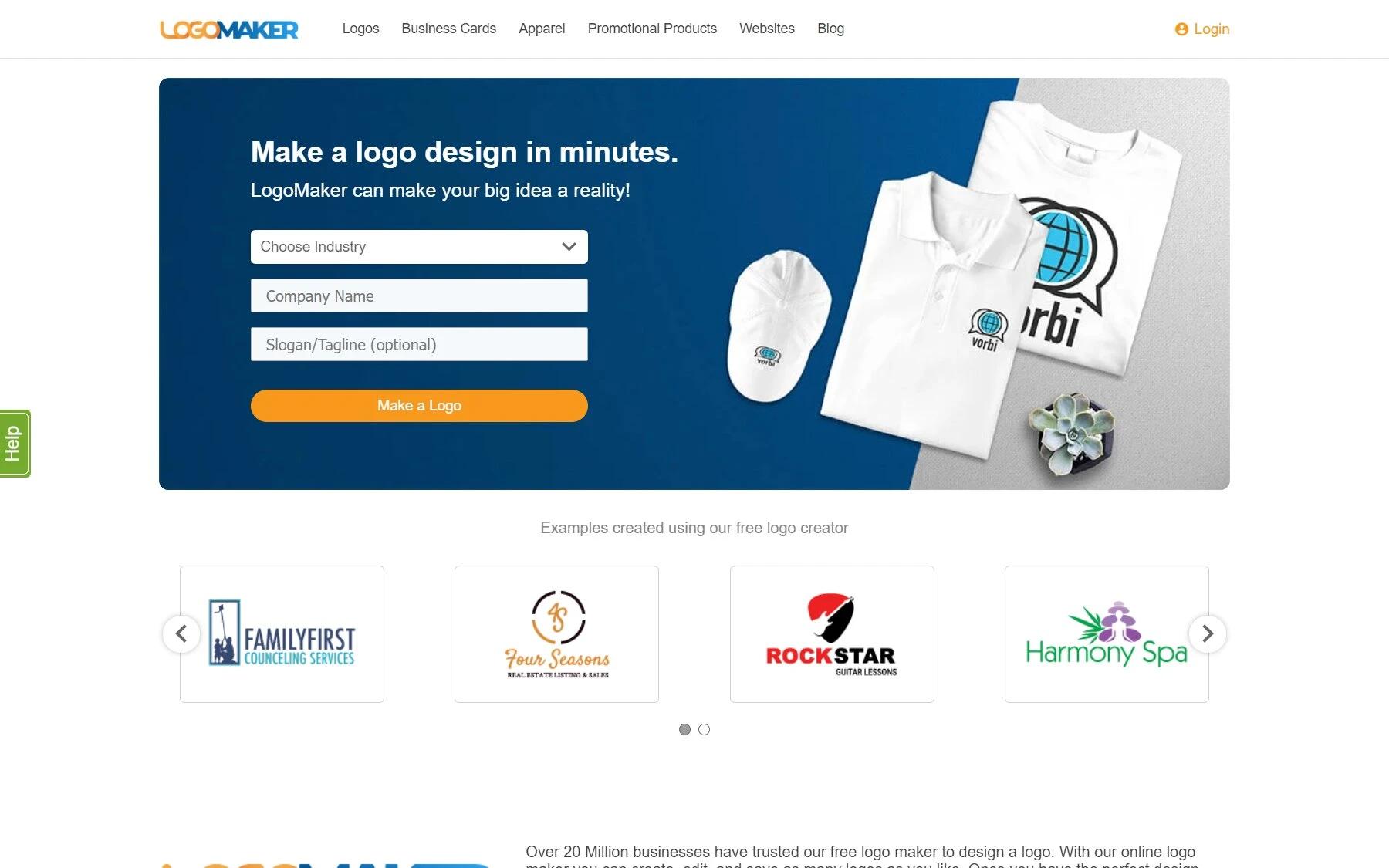
Logo Maker
Launched in 2013, LogoMaker is there for everyone to design anything for free. The user interface is simple and pretty much self-explanatory. You can also watch different tutorials if you want on the website.
Visit, and you’ll see a Create a Design button. Click on it, and you’ll be redirected to create a new project. From there, click on T to add text, change its size, style, and color from the settings on the side.
Currently, it offers over 3 million graphic design elements, which is pretty cool. Search anything, use it, alter the size, color, and place it above, behind, overlap, or whatever you desire.
Once you’re finished designing, download it for free in png format to directly upload on your website, social media, or anywhere.
Canva
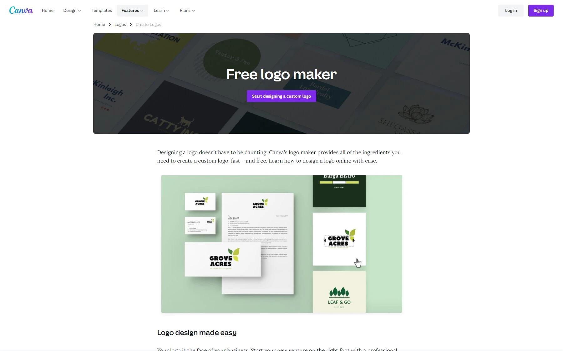
Canva
Canva is another popular design platform for both amateur and pro designers. Visit, and you’ll be taken to a new custom logo design page. Then, from the side menu, you’ll see free logo templates for all different industries. Here you can find logos for your, medical, educational, religious blogs and websites.
Either completely start from scratch or click your brand’s relevant category and scroll through templates. Pick anything you love. Then from the side editing window, all you need to do is to replace the text, design element, or any color shifts you may want.
Download in the png format once you’re finished. It’s that simple and fast.
Logaster
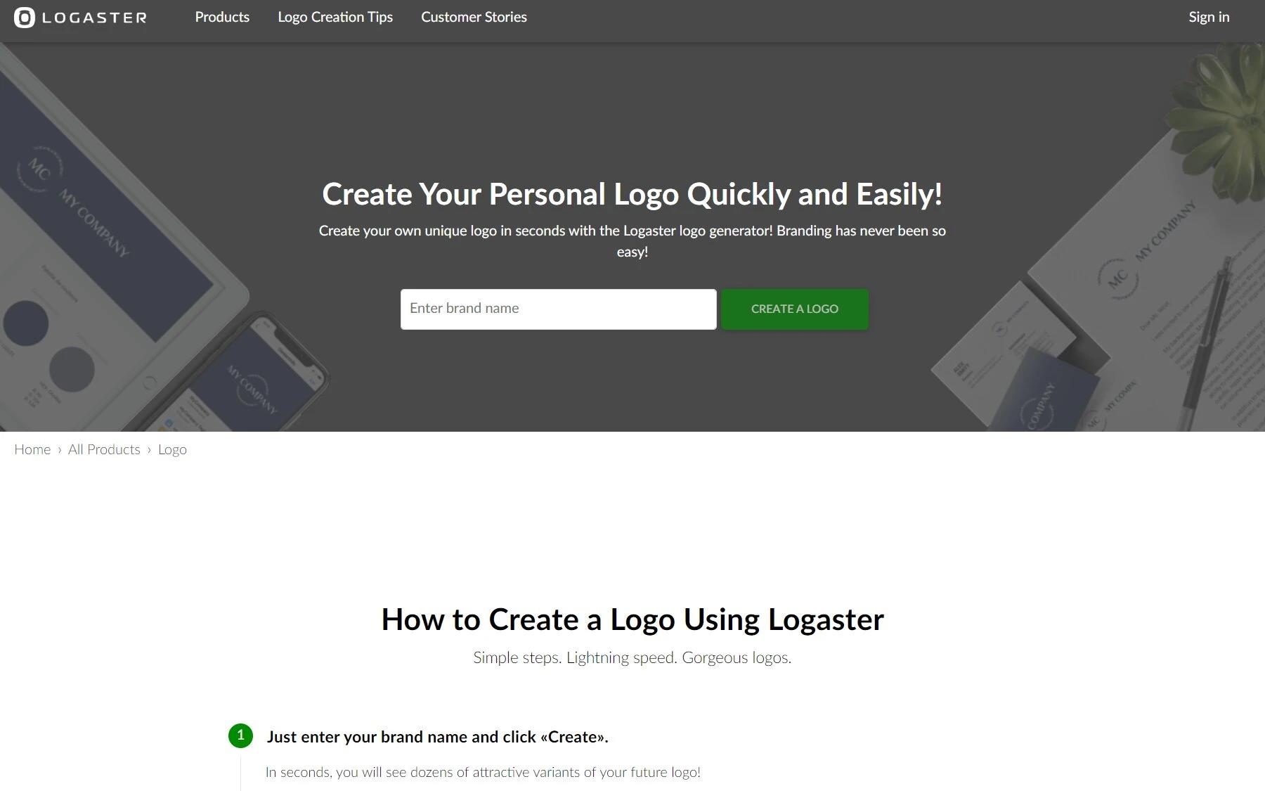
Logaster
Almost like Canva, this is another free online tool. But, Logaster feels much more straightforward and fast. Visit, and you’ll be asked to put your brand name. Next, as soon as you click next, you’ll see a logo displayed already in front.
If you don’t like it, you can customize it based on your industry, color palettes, and maybe even add a tagline. Once you’re satisfied, you can also preview brochures, letters, emails, and/or icons with your logo. Download the finished design in png by creating a free account there.
Paid Tools and Services
Free tools may not fully give you copyrights or that high quality. That’s where paid tools and services come in to own something exclusive just for your brand. Read your options below:
Upwork
Upwork
Upwork is a popular marketplace to hire freelancers for just about any digital service. Go there, publish a job post with your logo briefs. If you’re not sure about how you can create logo briefs, check the step #1 above.
High-rated designers there can cost you somewhere between $100-500. And, if you’re simply looking for something good enough, but only exclusive to you, below $100 will also do easily.
Make sure you get the final files in vector format, usually in AI, SVG, or EPS. Vector file types allow increasing or decreasing the logo size without losing quality. To open these file types, you need a program such as Adobe Illustrator or Inkscape. And from there, you can convert them into pngs and desired sizes to publish on different networks and places.
Fiverr
Fiverr
It’s also another online marketplace, just like Upwork. Features and job posting structure slightly varies but pretty much self-explanatory.
Go there, search for logo design services. You’ll see gigs starting from 5$ to all the way up to 100$, and more. Read the gig’s descriptions carefully, so you’ll know what you’re getting. Go with profiles with more positive reviews.
You might want to cut the price, but understand that great designers won’t charge anywhere near the 5 or 10 dollar range. Spend wisely there.
Freelancer
Freelancer
This platform is also almost the same as above. Go there, and from the I WANT TO HIRE button, submit your details, and proceed to publish a job post. Keep in mind the same guidelines while hiring.
During the research, I discovered many clients and freelancers reported about frequent scams. So be cautious beforehand. Read about freelance scams and how to avoid them.
Now, let’s talk about some of the online tools where no hiring process is involved.
Placeit
Placeit
Placeit offers unlimited design elements and templates with 15$ monthly or 90$ yearly subscription. Pre-made templates make it a lot easier to customize a logo on your own.
Simply click on a template from the categories in the sidebar. Change the color, text, or element in any way you want – and you’ve got it. Download and your logo is publish-ready.
Tailor Brands Logo Maker
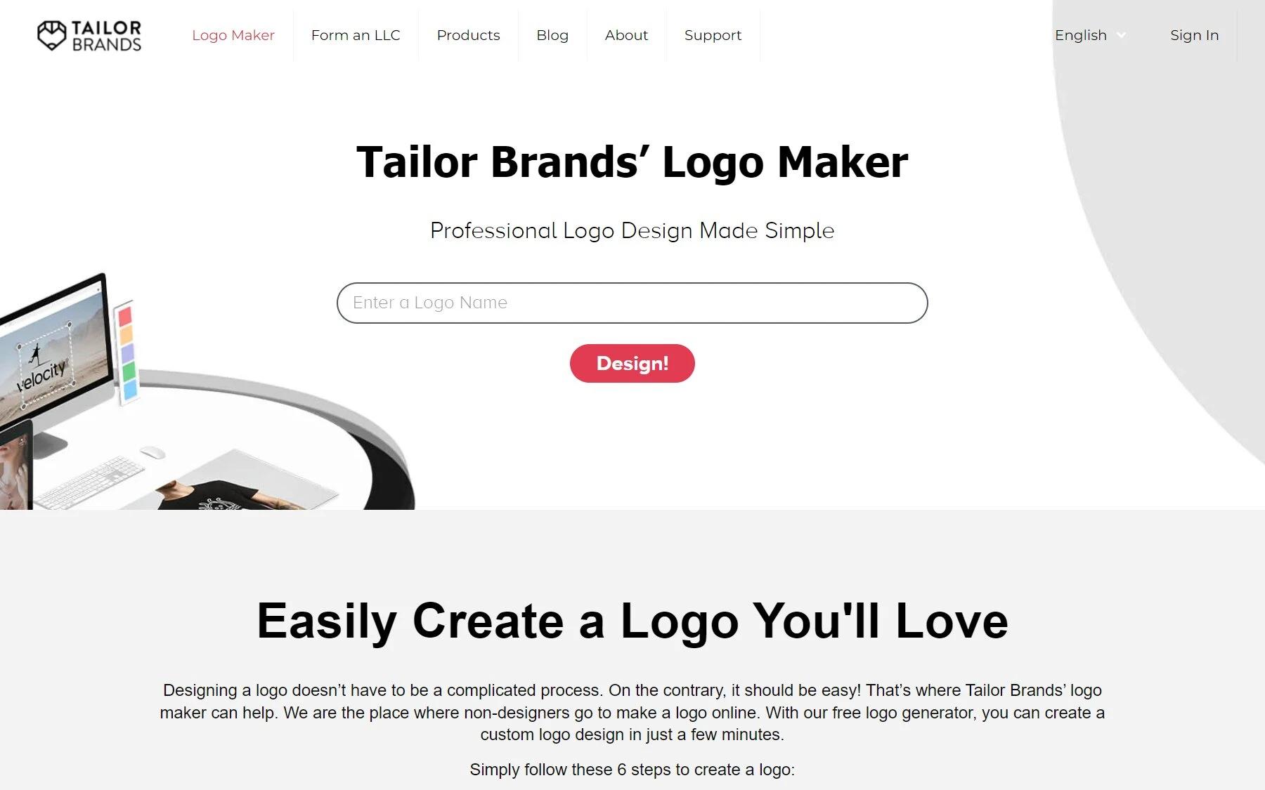
Tailor Brands Logo Maker
Tailor Brands is also an online logo maker website, where you submit your brand name, and after specifying your likes and dislikes, the website creates the final design automatically. You will still have the option of tweaking it on your own, which is great if you want to add your own flavor.
Tailor Brands logo maker no longer allows free downloads. The monthly subscription starts from 4$, and yearly from 2$. It’s very affordable as compared to other paid websites. With a couple of dimes, you get a good enough logo exclusive for your brand.
99Designs
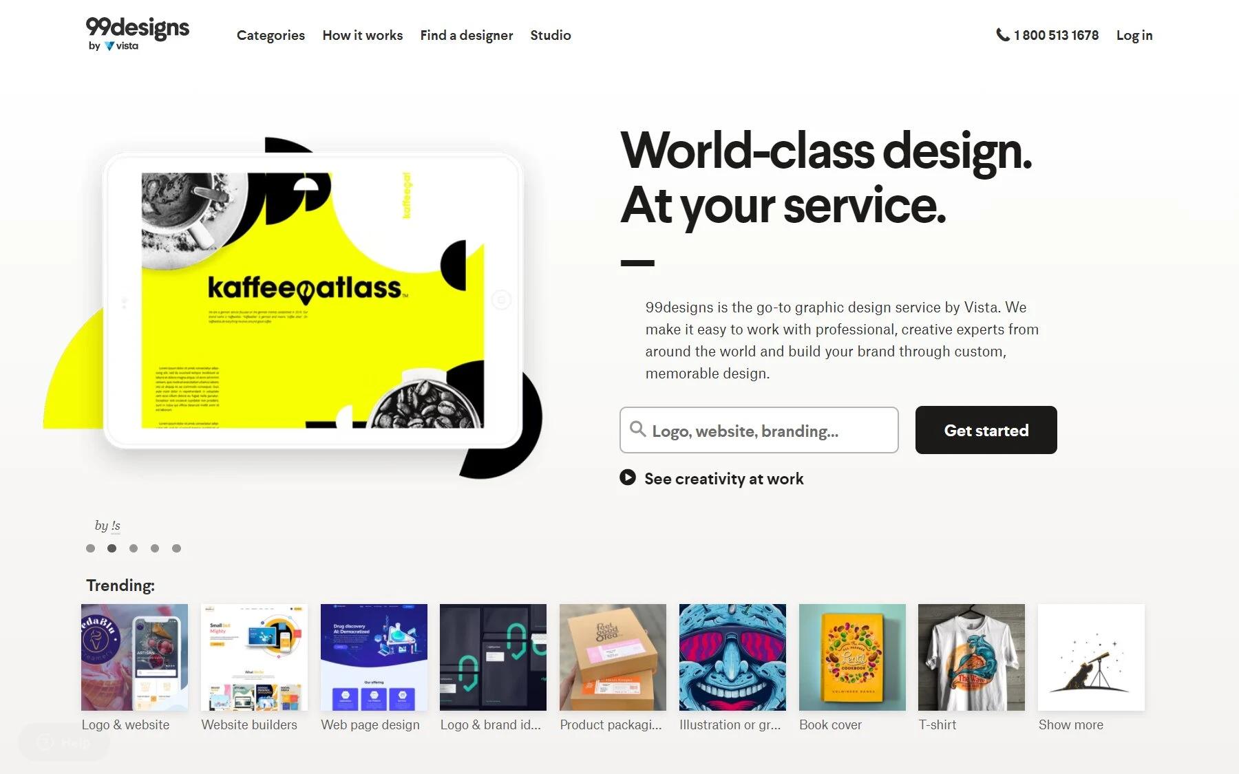
99Designs
99Design is a cool place: you get to submit your briefs, and pro designers around the globe will pitch their ideas. Select anyone you like, and get the logo delivered. But, be sure you get your briefs right. If you’re not sure what you want your logo to be like, see the step #1 above on identifying your brand voice.
Yet, don’t fret. 99Designs also shows you some logo types you may prefer, the brand feel, the colors and what they mean, whether it’s classic or modern, and everything in between – to help you sort out your briefs.
Also, you get a money-back guarantee if, for whatever reason, you don’t feel you love the logo.
All things seem great, but their logo design services feel kinda expensive, starting from a fixed 500$ price. If you’ve a budget, go for it.
Designhill
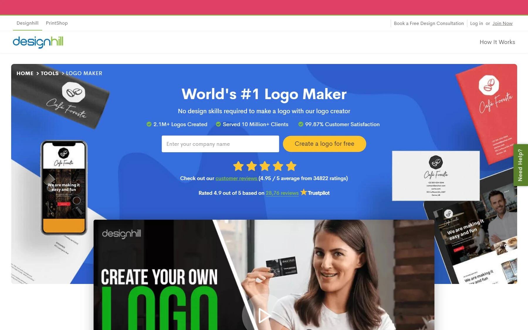
Designhill
Designhill is also similar to 99Designs. Go there and post your briefs. Designers around the globe will bid on your project, and you get to choose what you like. There again, Designhill will help you specify your briefs so you can get a more customized logo for your brand.
Good thing their pricing is lower than 99Designs, starting from 289$. Do keep an eye on the extras with different packages.
Now, Over to You
Ready to start yet? Take the steps above as a guideline: Understand your brand’s voice, research, get inspiration from competitors, sketch, use programs to edit, and finally integrate on your website and social handles.
There’s essentially no wrong or right way – as long as your creative design work is practical, go for it. Even the workflow of pros designers varies by miles.
Or, as a quick fix, hire or use online website tools that make things a lot easier and faster.
Good luck. Make a comment below your thoughts.
Or, read the next steps on marketing and growing your blog.